Chapter 9 Using Transformations to “Normalize” Distributions
- When we are confronted with a variable that is not Normally distributed but that we wish was Normally distributed, it is sometimes useful to consider whether working with a transformation of the data will yield a more helpful result.
- Many statistical methods, including t tests and analyses of variance, assume Normal distributions.
- We’ll discuss using R to assess a range of what are called Box-Cox power transformations, via plots, mainly.
9.1 The Ladder of Power Transformations
The key notion in re-expression of a single variable to obtain a distribution better approximated by the Normal or re-expression of an outcome in a simple regression model is that of a ladder of power transformations, which applies to any unimodal data.
| Power | Transformation |
|---|---|
| 3 | x3 |
| 2 | x2 |
| 1 | x (unchanged) |
| 0.5 | x0.5 = \(\sqrt{x}\) |
| 0 | ln x |
| -0.5 | x-0.5 = 1/\(\sqrt{x}\) |
| -1 | x-1 = 1/x |
| -2 | x-2 = 1/x2 |
9.2 Using the Ladder
As we move further away from the identity function (power = 1) we change the shape more and more in the same general direction.
- For instance, if we try a logarithm, and this seems like too much of a change, we might try a square root instead.
- Note that this ladder (which like many other things is due to John Tukey) uses the logarithm for the “power zero” transformation rather than the constant, which is what x0 actually is.
- If the variable x can take on negative values, we might take a different approach. If x is a count of something that could be zero, we often simply add 1 to x before transformation.
9.3 Can we transform Waist Circumferences?
Here are a pair of plots describing the waist circumference data in the NYFS data.
p1 <- ggplot(nyfs1, aes(x = waist.circ)) +
    geom_histogram(aes(y = ..density..),
                   binwidth=2, fill = "purple", color = "yellow") +
    stat_function(fun = dnorm, args = list(mean = mean(nyfs1$waist.circ),
                                           sd = sd(nyfs1$waist.circ))) +
    labs(x = "Waist Circumference", title="Histogram + Normal Model")

p2 <- ggplot(nyfs1, aes(sample = waist.circ)) +
    geom_point(stat="qq", color = "purple") +
    labs(y = "Ordered Waist Circumferences", title="Normal Q-Q plot")

library(grid)
# this approach to top label lets us adjust
# the size and font (here bold) used in the main title
gridExtra::grid.arrange(p1, p2, ncol=2,
             top = textGrob("Waist Circumference in the nyfs1 data",
                            gp=gpar(fontsize=15,font=2)))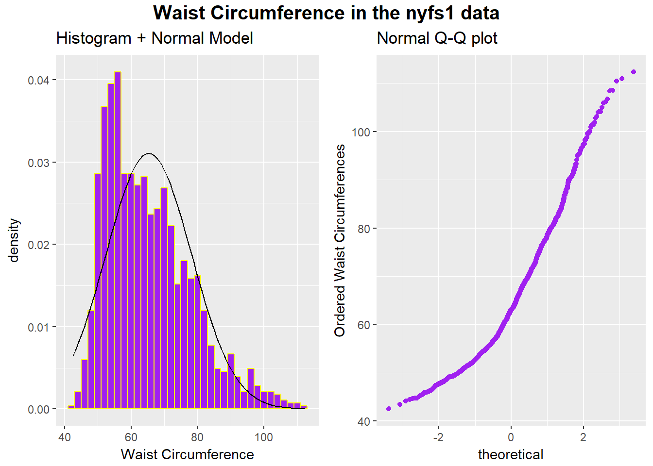
## clean up
rm(p1, p2)
All of the values are positive, naturally, and there is some sign of skew. If we want to use the tools of the Normal distribution to describe these data, we might try taking a step “up” our ladder from power 1 to power 2.
9.3.1 The Square
Does squaring the Waist Circumference data help to “Normalize” the histogram?
ggplot(nyfs1, aes(x = waist.circ^2)) +
    geom_histogram(aes(y = ..density..), bins = 30, fill = "purple", col="white") +
    stat_function(fun = dnorm, lwd = 1.5, col = "black",
                  args = list(mean = mean(nyfs1$waist.circ^2), sd = sd(nyfs1$waist.circ^2))) +
    annotate("text", x = 8000, y = 0.0002, col = "black",
             label = paste("Mean = ", round(mean(nyfs1$waist.circ^2),2),
                           ", SD = ", round(sd(nyfs1$waist.circ^2),2))) +
labs(title = "NYFS1 Waist Circumference, squared, with fitted Normal density")![]()
Looks like that was the wrong direction. Shall we try moving down the ladder instead?
9.3.2 The Square Root
Would a square root applied to the waist circumference data help alleviate that right skew?
ggplot(nyfs1, aes(x = sqrt(waist.circ))) +
    geom_histogram(aes(y = ..density..), bins = 30,
                   fill = "purple", col="white") +
    stat_function(fun = dnorm, lwd = 1.5, col = "black",
                  args = list(mean = mean(sqrt(nyfs1$waist.circ)),
                              sd = sd(sqrt(nyfs1$waist.circ)))) +
    annotate("text", x = 9.5, y = 0.5, col = "black",
             label = paste("Mean = ", round(mean(sqrt(nyfs1$waist.circ)),2),
                           ", SD = ", round(sd(sqrt(nyfs1$waist.circ)),2))) +
labs(title = "Square Root of NYFS1 Waist Circumference, with fitted Normal density")![]()
That looks a lot closer to a Normal distribution. Consider the Normal Q-Q plot below.
ggplot(nyfs1, aes(sample = sqrt(waist.circ))) +
    geom_point(stat="qq", color = "purple") +
    labs(y = "Ordered Square root of Waist Circumference",
title="Normal Q-Q plot of Square Root of Waist Circumference")![]()
9.3.3 The Logarithm
We might also try a logarithm of the waist circumference data. We can use either the natural logarithm (log, in R) or the base-10 logarithm (log10, in R) - either will have the same impact on skew.
p1 <- ggplot(nyfs1, aes(x = log10(waist.circ))) +
    geom_histogram(aes(y = ..density..),
                   bins=20, fill = "purple", color = "yellow") +
    stat_function(fun = dnorm, args = list(mean = mean(log10(nyfs1$waist.circ)),
                                           sd = sd(log10(nyfs1$waist.circ)))) +
    labs(x = "log_10 of Waist Circumference", title="Histogram with Normal Density")

p2 <- ggplot(nyfs1, aes(sample = log10(waist.circ))) +
    geom_point(stat="qq", color = "purple") +
    labs(y = "Ordered log_10(Waist Circumference)", title="Normal Q-Q Plot")

gridExtra::grid.arrange(p1, p2, ncol=2,
             top = textGrob("log10(Waist Circumference): nyfs1 data",
                            gp=gpar(fontsize=15,font=2)))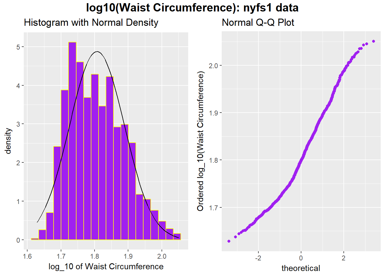
## clean up
rm(p1, p2)
p1 <- ggplot(nyfs1, aes(x = log(waist.circ))) +
geom_histogram(aes(y = ..density..),
bins=20, fill = "purple", color = "yellow") +
stat_function(fun = dnorm,
args = list(mean = mean(log(nyfs1$waist.circ)),
sd = sd(log(nyfs1$waist.circ)))) +
labs(x = "log of Waist Circumference", title="Histogram with Normal Density")
p2 <- ggplot(nyfs1, aes(sample = log(waist.circ))) +
geom_point(stat="qq", color = "purple") +
labs(y = "Ordered log(Waist Circumference)", title="Normal Q-Q Plot")
gridExtra::grid.arrange(p1, p2, ncol=2,
top = textGrob("Natural Log of Waist Circumference: nyfs1 data",
gp=gpar(fontsize=15,font=2)))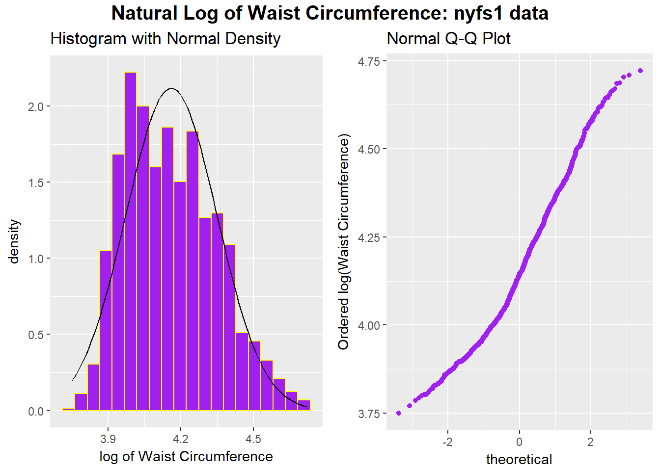
## clean up
rm(p1, p2)
9.4 A Simulated Data Set with Left Skew
set.seed(431); data2 <- data.frame(sample2 = 100*rbeta(n = 125, shape1 = 5, shape2 = 2))If we’d like to transform these data so as to better approximate a Normal distribution, where should we start? What transformation do you suggest?
ggplot(data2, aes(x = sample2)) +
    geom_histogram(aes(y = ..density..),
                   bins = 20, fill = "dodgerblue", col="white") +
    stat_function(fun = dnorm, lwd = 1.5, col = "purple",
                  args = list(mean = mean(data2$sample2),
                              sd = sd(data2$sample2))) +
    annotate("text", x = 40, y = 0.02, col = "purple",
             label = paste("Mean = ", round(mean(data2$sample2),2),
                           ", SD = ", round(sd(data2$sample2),2))) +
labs(title = "Sample 2, untransformed, with fitted Normal density")![]()
9.5 Transformation Example 2: Ladder of Potential Transformations in Frequency Polygons
p1 <- ggplot(data2, aes(x = sample2^3)) + geom_freqpoly(col = "black", bins = 20)
p2 <- ggplot(data2, aes(x = sample2^2)) + geom_freqpoly(col = "red", bins = 20)
p3 <- ggplot(data2, aes(x = sample2)) + geom_freqpoly(col = "blue", bins = 20)
p4 <- ggplot(data2, aes(x = sqrt(sample2))) + geom_freqpoly(col = "purple", bins = 20)
p5 <- ggplot(data2, aes(x = log(sample2))) + geom_freqpoly(col = "navy", bins = 20)
p6 <- ggplot(data2, aes(x = 1/sqrt(sample2))) + geom_freqpoly(col = "chocolate", bins = 20)
p7 <- ggplot(data2, aes(x = 1/sample2)) + geom_freqpoly(col = "tomato", bins = 20)
p8 <- ggplot(data2, aes(x = 1/(sample2^2))) + geom_freqpoly(col = "darkcyan", bins = 20)
p9 <- ggplot(data2, aes(x = 1/(sample2^3))) + geom_freqpoly(col = "magenta", bins = 20)

gridExtra::grid.arrange(p1, p2, p3, p4, p5, p6, p7, p8, p9, nrow=3,
top="Ladder of Power Transformations")![]()
9.6 Transformation Example 2 Ladder with Normal Q-Q Plots
p1 <- ggplot(data2, aes(sample = sample2^3)) +
geom_point(stat="qq", col = "black") + labs(title = "x^3")
p2 <- ggplot(data2, aes(sample = sample2^2)) +
geom_point(stat="qq", col = "red") + labs(title = "x^2")
p3 <- ggplot(data2, aes(sample = sample2)) +
geom_point(stat="qq", col = "blue") + labs(title = "x")
p4 <- ggplot(data2, aes(sample = sqrt(sample2))) +
geom_point(stat="qq", col = "purple") + labs(title = "sqrt(x)")
p5 <- ggplot(data2, aes(sample = log(sample2))) +
geom_point(stat="qq", col = "navy") + labs(title = "log x")
p6 <- ggplot(data2, aes(sample = 1/sqrt(sample2))) +
geom_point(stat="qq", col = "chocolate") + labs(title = "1/sqrt(x)")
p7 <- ggplot(data2, aes(sample = 1/sample2)) +
geom_point(stat="qq", col = "tomato") + labs(title = "1/x")
p8 <- ggplot(data2, aes(sample = 1/(sample2^2))) +
geom_point(stat="qq", col = "darkcyan") + labs(title = "1/(x^2)")
p9 <- ggplot(data2, aes(sample = 1/(sample2^3))) +
geom_point(stat="qq", col = "magenta") + labs(title = "1/(x^3)")

gridExtra::grid.arrange(p1, p2, p3, p4, p5, p6, p7, p8, p9, nrow=3,
bottom="Ladder of Power Transformations")![]()
It looks like taking the square of the data produces the most “Normalish” plot in this case.