Chapter 9 Using Transformations to “Normalize” Distributions
- When we are confronted with a variable that is not Normally distributed but that we wish was Normally distributed, it is sometimes useful to consider whether working with a transformation of the data will yield a more helpful result.
- Many statistical methods, including t tests and analyses of variance, assume Normal distributions.
- We’ll discuss using R to assess a range of what are called Box-Cox power transformations, via plots, mainly.
9.1 The Ladder of Power Transformations
The key notion in re-expression of a single variable to obtain a distribution better approximated by the Normal or re-expression of an outcome in a simple regression model is that of a ladder of power transformations, which applies to any unimodal data.
| Power | Transformation |
|---|---|
| 3 | x3 |
| 2 | x2 |
| 1 | x (unchanged) |
| 0.5 | x0.5 = \(\sqrt{x}\) |
| 0 | ln x |
| -0.5 | x-0.5 = 1/\(\sqrt{x}\) |
| -1 | x-1 = 1/x |
| -2 | x-2 = 1/x2 |
9.2 Using the Ladder
As we move further away from the identity function (power = 1) we change the shape more and more in the same general direction.
- For instance, if we try a logarithm, and this seems like too much of a change, we might try a square root instead.
- Note that this ladder (which like many other things is due to John Tukey) uses the logarithm for the “power zero” transformation rather than the constant, which is what x0 actually is.
- If the variable x can take on negative values, we might take a different approach. If x is a count of something that could be zero, we often simply add 1 to x before transformation.
The ladder of power transformations is particularly helpful when we are confronted with data that shows skew.
- To handle right skew (where the mean exceeds the median) we usually apply powers below 1.
- To handle left skew (where the median exceeds the mean) we usually apply powers greater than 1.
The most common transformations are the square (power 2), the square root (power 1/2), the logarithm (power 0) and the inverse (power -1), and I usually restrict myself to those options in practical work.
9.3 Protein Consumption in the NNYFS data
Here are the protein consumption (in grams) results from the NNYFS data.
  min    Q1 median     Q3    max     mean       sd    n missing
 4.18 45.33 61.255 82.565 241.84 66.90148 30.96319 1518       0
p1 <- ggplot(nnyfs, aes(x = "Protein", y = protein)) +
geom_violin() +
geom_boxplot(width = 0.2, fill = "salmon",
outlier.color = "red") +
theme_light() +
labs(title = "NNYFS Protein consumption",
x = "", y = "Protein Consumption (g)")
p2 <- ggplot(nnyfs, aes(sample = protein)) +
geom_qq(col = "salmon") +
geom_qq_line(col = "black") +
theme_light() +
labs(title = "NNYFS Protein Consumption",
y = "Protein Consumption (g)")
p1 + p2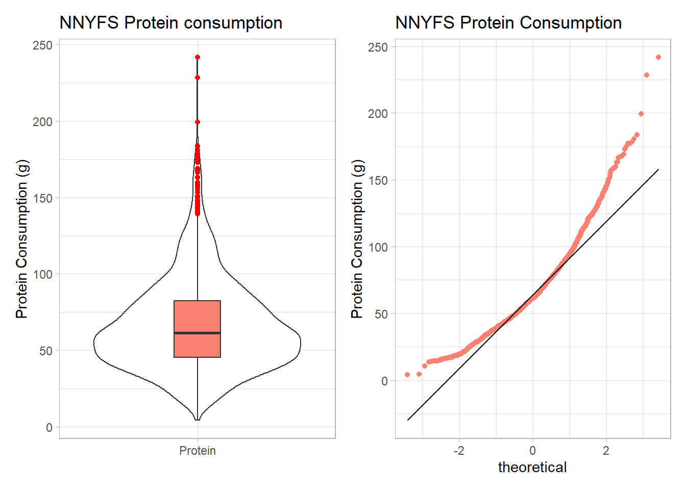
The key point here is that we see several signs of meaningful right skew, and we’ll want to consider a transformation that might make a Normal model more plausible.
9.3.1 Using patchwork to compose plots
For me, the slickest approach to composing how a series of plots are placed together is available in the patchwork package. Here’s another example.
res <- mosaic::favstats(~ protein, data = nnyfs)
bin_w <- 5 # specify binwidth

p1 <- ggplot(nnyfs, aes(x = protein)) +
    geom_histogram(binwidth = bin_w,
                   fill = "salmon",
                   col = "white") +
    theme_light() +
    stat_function(
        fun = function(x) dnorm(x, mean = res$mean,
                                sd = res$sd) *
            res$n * bin_w,
        col = "darkred", size = 2) +
    labs(title = "Histogram with Normal fit",
         x = "Protein Consumption (g)", y = "# of subjects")


p2 <- ggplot(nnyfs, aes(sample = protein)) +
    geom_qq(col = "salmon") +
    geom_qq_line(col = "black") +
    theme_light() +
    labs(title = "Normal Q-Q plot",
         y = "Protein Consumption (g)")

p3 <- ggplot(nnyfs, aes(x = "", y = protein)) +
    geom_violin() +
    geom_boxplot(width = 0.2, fill = "salmon",
                 outlier.color = "red") +
    theme_light() +
    coord_flip() +
    labs(title = "Boxplot with Violin",
         x = "", y = "Protein Consumption (g)")

p1 + p2 - p3 + plot_layout(ncol = 1, height = c(3, 1)) +
    plot_annotation(title = "NNYFS Protein Consumption")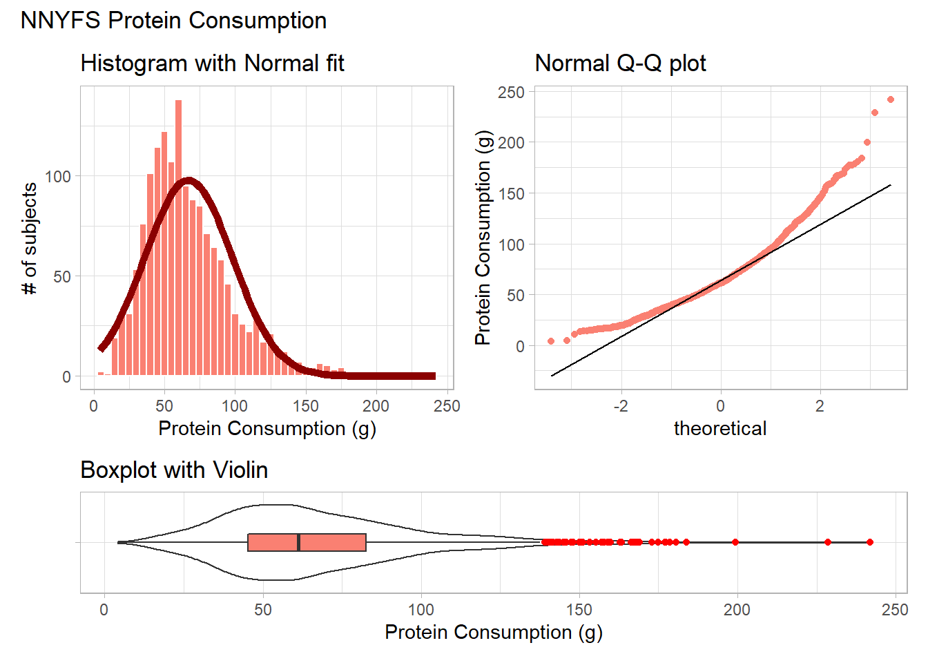
For more on the patchwork package, check out its repository at https://github.com/thomasp85/patchwork.
9.4 Can we transform the protein data?
As we’ve seen, the protein data are right skewed, and all of the values are strictly positive. If we want to use the tools of the Normal distribution to describe these data, we might try taking a step “down” our ladder from power 1 (raw data) to lower powers.
9.4.1 The Square Root
Would a square root applied to the protein data help alleviate that right skew?
res <- mosaic::favstats(~ sqrt(protein), data = nnyfs)
bin_w <- 1 # specify binwidth

p1 <- ggplot(nnyfs, aes(x = sqrt(protein))) +
    geom_histogram(binwidth = bin_w,
                   fill = "salmon",
                   col = "white") +
    theme_light() +
    stat_function(
        fun = function(x) dnorm(x, mean = res$mean,
                                sd = res$sd) *
            res$n * bin_w,
        col = "darkred", size = 2) +
    labs(title = "Histogram with Normal fit",
         x = "Square Root of Protein Consumption (g)", y = "# of subjects")


p2 <- ggplot(nnyfs, aes(sample = sqrt(protein))) +
    geom_qq(col = "salmon") +
    geom_qq_line(col = "black") +
    theme_light() +
    labs(title = "Normal Q-Q plot",
         y = "Square Root of Protein Consumption (g)")

p3 <- ggplot(nnyfs, aes(x = "", y = sqrt(protein))) +
    geom_violin() +
    geom_boxplot(width = 0.2, fill = "salmon",
                 outlier.color = "red") +
    theme_light() +
    coord_flip() +
    labs(title = "Boxplot with Violin",
         x = "", y = "Square Root of Protein Consumption (g)")

p1 + p2 - p3 + plot_layout(ncol = 1, height = c(3, 1)) +
    plot_annotation(title = "Square Root of NNYFS Protein Consumption")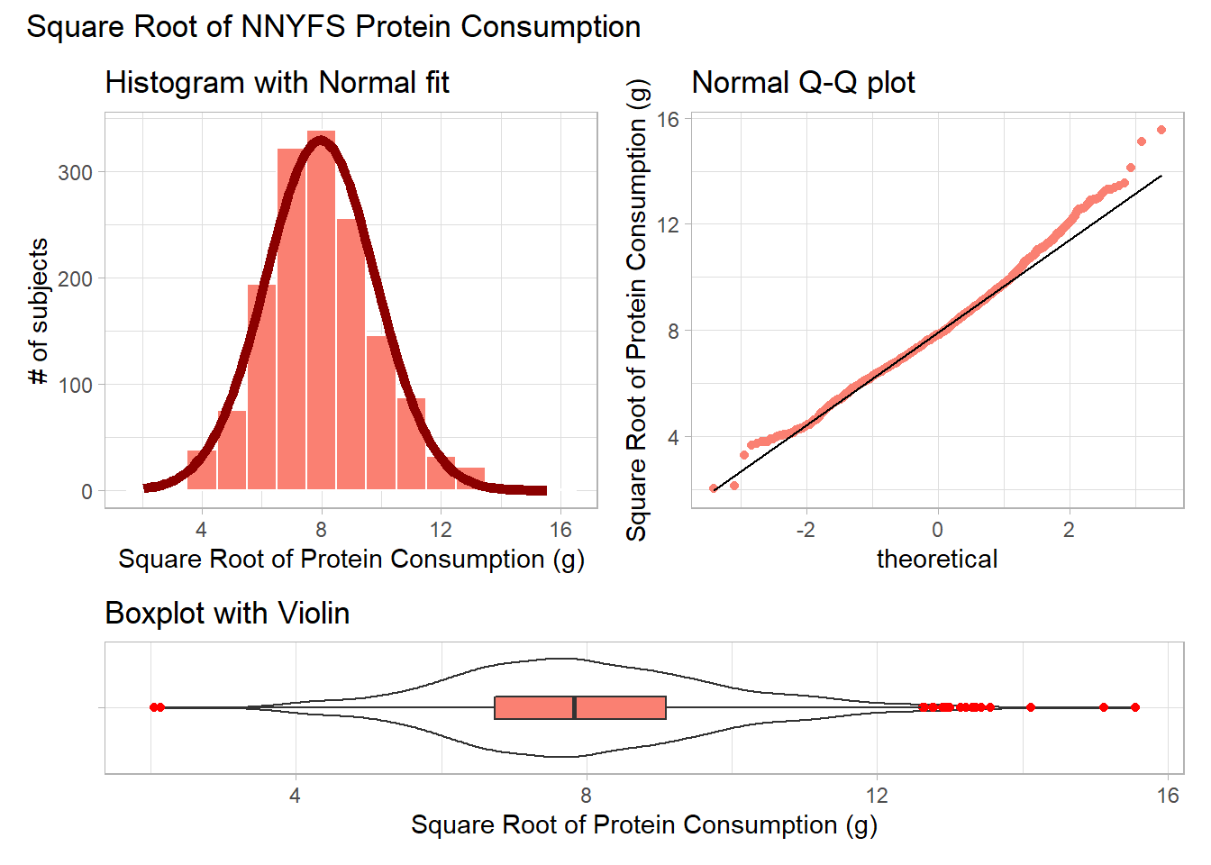
That looks like a more symmetric distribution, certainly, although we still have some outliers on the right side of the distribution. Should we take another step down the ladder?
9.4.2 The Logarithm
We might also try a logarithm of the energy circumference data. We can use either the natural logarithm (log, in R) or the base-10 logarithm (log10, in R) - either will have the same impact on skew.
res <- mosaic::favstats(~ log(protein), data = nnyfs)
bin_w <- 0.5 # specify binwidth

p1 <- ggplot(nnyfs, aes(x = log(protein))) +
    geom_histogram(binwidth = bin_w,
                   fill = "salmon",
                   col = "white") +
    theme_light() +
    stat_function(
        fun = function(x) dnorm(x, mean = res$mean,
                                sd = res$sd) *
            res$n * bin_w,
        col = "darkred", size = 2) +
    labs(title = "Histogram with Normal fit",
         x = "Log of Protein Consumption (g)", y = "# of subjects")


p2 <- ggplot(nnyfs, aes(sample = log(protein))) +
    geom_qq(col = "salmon") +
    geom_qq_line(col = "black") +
    theme_light() +
    labs(title = "Normal Q-Q plot",
         y = "Log of Protein Consumption (g)")

p3 <- ggplot(nnyfs, aes(x = "", y = log(protein))) +
    geom_violin() +
    geom_boxplot(width = 0.2, fill = "salmon",
                 outlier.color = "red") +
    theme_light() +
    coord_flip() +
    labs(title = "Boxplot with Violin",
         x = "", y = "Log of Protein Consumption (g)")

p1 + p2 - p3 + plot_layout(ncol = 1, height = c(3, 1)) +
    plot_annotation(title = "Logarithm of NNYFS Protein Consumption")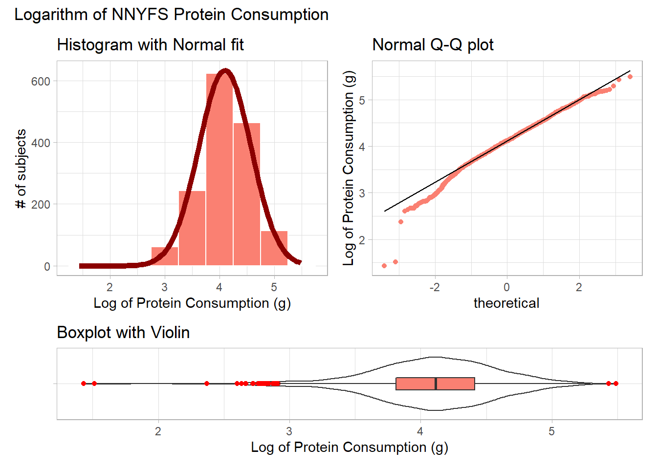
Now, it looks like we may have gone too far in the other direction. It looks like the square root is a sensible choice to try to improve the fit of a Normal model to the protein consumption data.
9.4.3 This course uses Natural Logarithms, unless otherwise specified
In this course, we will assume the use of natural logarithms unless we specify otherwise. Following R’s convention, we will use log for natural logarithms.
9.5 What if we considered all 9 available transformations?
p1 <- ggplot(nnyfs, aes(sample = protein^3)) +
    geom_qq(col = "salmon") +
    geom_qq_line(col = "black") +
    theme_light() +
    labs(title = "Cube (power 3)",
         y = "Protein, Cubed")

p2 <- ggplot(nnyfs, aes(sample = protein^2)) +
    geom_qq(col = "salmon") +
    geom_qq_line(col = "black") +
    theme_light() +
    labs(title = "Square (power 2)",
         y = "Protein, Squared")

p3 <- ggplot(nnyfs, aes(sample = protein)) +
    geom_qq(col = "salmon") +
    geom_qq_line(col = "black") +
    theme_light() +
    labs(title = "Original Data",
         y = "Protein (g)")


p4 <- ggplot(nnyfs, aes(sample = sqrt(protein))) +
    geom_qq(col = "salmon") +
    geom_qq_line(col = "black") +
    theme_light() +
    labs(title = "sqrt (power 0.5)",
         y = "Square Root of Protein")

p5 <- ggplot(nnyfs, aes(sample = log(protein))) +
    geom_qq(col = "salmon") +
    geom_qq_line(col = "black") +
    theme_light() +
    labs(title = "log (power 0)",
         y = "Natural Log of Protein")

p6 <- ggplot(nnyfs, aes(sample = protein^(-0.5))) +
    geom_qq(col = "salmon") +
    geom_qq_line(col = "black") +
    theme_light() +
    labs(title = "1/sqrt (power -0.5)",
         y = "1/Square Root(Protein)")


p7 <- ggplot(nnyfs, aes(sample = 1/protein)) +
    geom_qq(col = "salmon") +
    geom_qq_line(col = "black") +
    theme_light() +
    labs(title = "Inverse (power -1)",
         y = "1/Protein")

p8 <- ggplot(nnyfs, aes(sample = 1/(protein^2))) +
    geom_qq(col = "salmon") +
    geom_qq_line(col = "black") +
    theme_light() +
    labs(title = "1/Square (power -2)",
         y = "1 /(Protein squared)")

p9 <- ggplot(nnyfs, aes(sample = 1/(protein^3))) +
    geom_qq(col = "salmon") +
    geom_qq_line(col = "black") +
    theme_light() +
    labs(title = "1/Cube (power -3)",
         y = "1/(Protein cubed)")


p1 + p2 + p3 + p4 + p5 + p6 + p7 + p8 + p9 +
    plot_layout(nrow = 3) +
    plot_annotation(title = "Transformations of NNYFS Protein Consumption")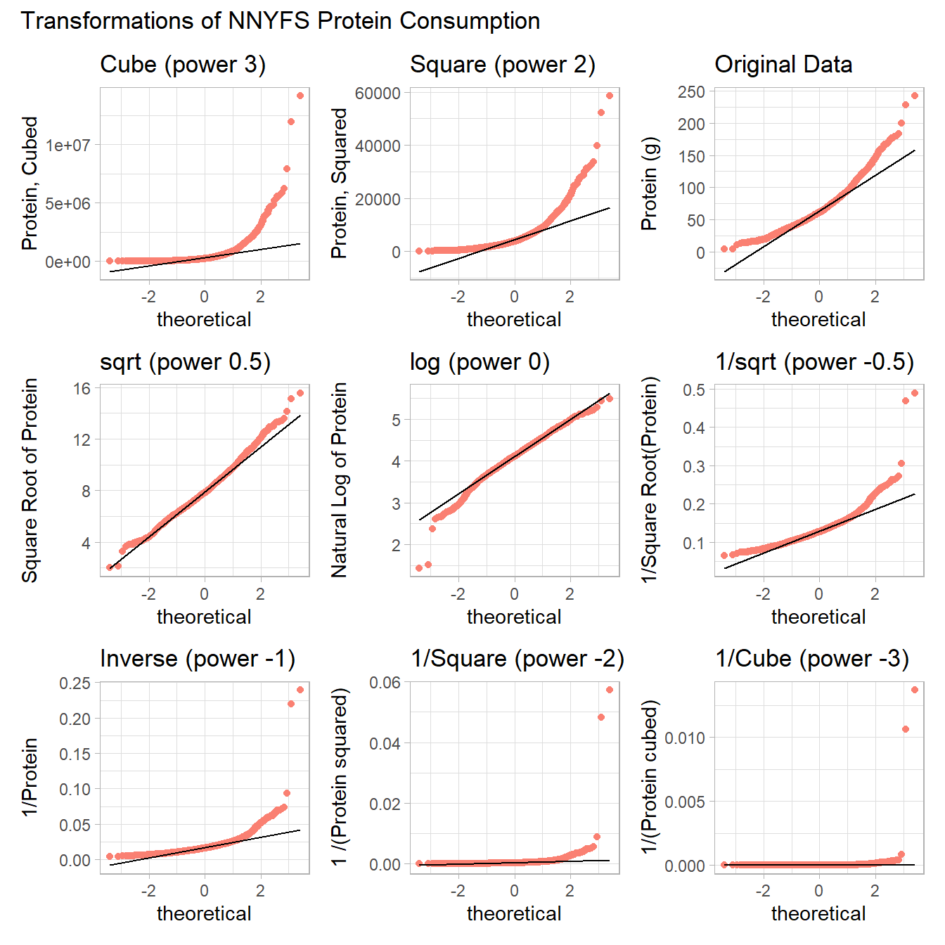
The square root still appears to be the best choice of transformation here, even after we consider all 8 transformation of the raw data.
9.6 A Simulated Data Set
If we’d like to transform these data so as to better approximate a Normal distribution, where should we start? What transformation do you suggest?
res <- mosaic::favstats(~ sample2, data = data2)
bin_w <- 4 # specify binwidth

p1 <- ggplot(data2, aes(x = sample2)) +
    geom_histogram(binwidth = bin_w,
                   fill = "royalblue",
                   col = "white") +
    theme_light() +
    stat_function(
        fun = function(x) dnorm(x, mean = res$mean,
                                sd = res$sd) *
            res$n * bin_w,
        col = "darkred", size = 2) +
    labs(title = "Histogram with Normal fit",
         x = "Simulated Data", y = "# of subjects")


p2 <- ggplot(data2, aes(sample = sample2)) +
    geom_qq(col = "royalblue") +
    geom_qq_line(col = "black") +
    theme_light() +
    labs(title = "Normal Q-Q plot",
         y = "Simulated Data")

p3 <- ggplot(data2, aes(x = "", y = sample2)) +
    geom_violin() +
    geom_boxplot(width = 0.3, fill = "royalblue",
                 outlier.color = "royalblue") +
    theme_light() +
    coord_flip() +
    labs(title = "Boxplot with Violin",
         x = "", y = "Simulated Data")

p1 + p2 - p3 + plot_layout(ncol = 1, height = c(3, 1)) +
    plot_annotation(title = "Simulated Data")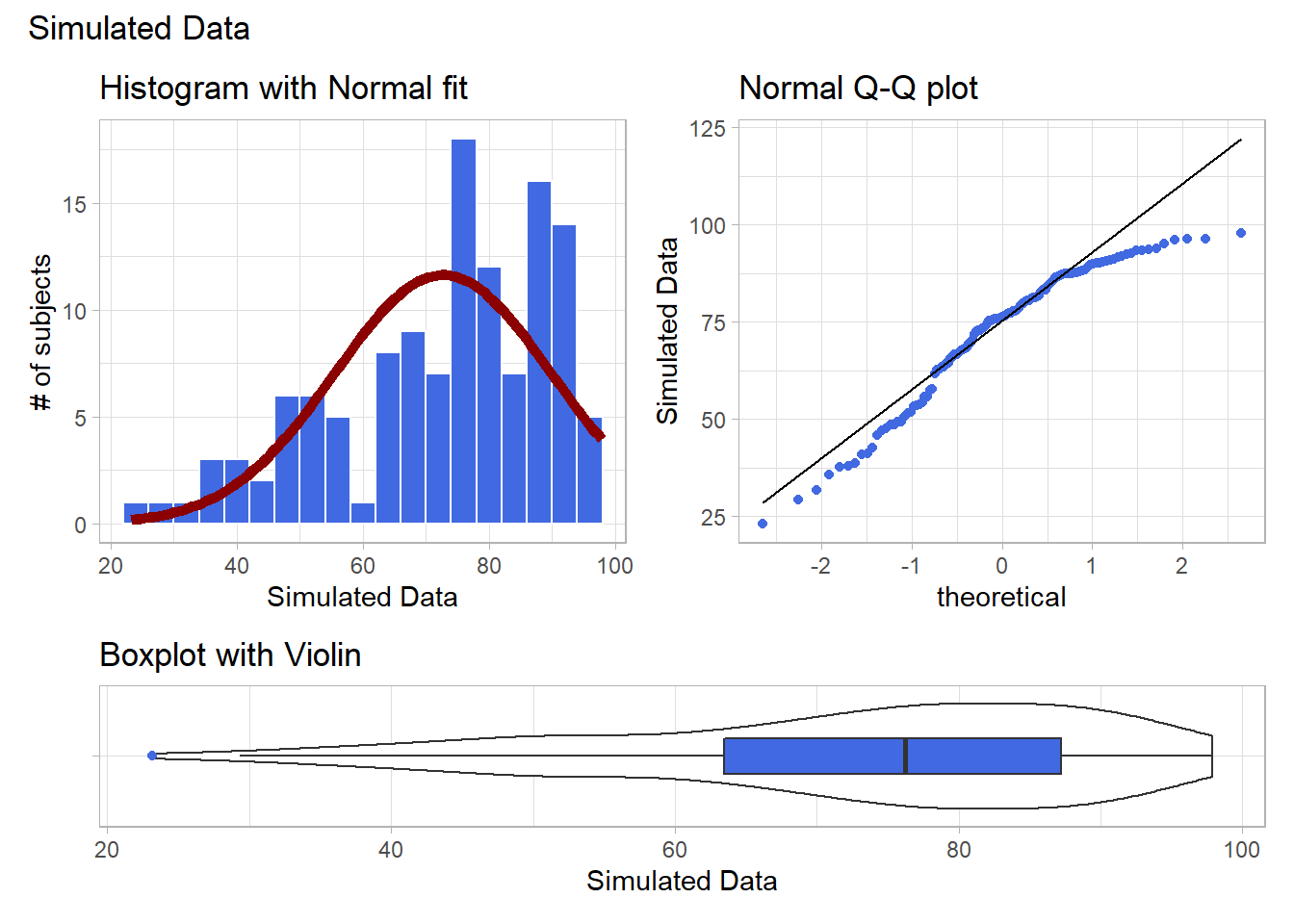
Given the left skew in the data, it looks like a step up in the ladder is warranted, perhaps by looking at the square of the data?
res <- mosaic::favstats(~ sample2^2, data = data2)
bin_w <- 600 # specify binwidth

p1 <- ggplot(data2, aes(x = sample2^2)) +
    geom_histogram(binwidth = bin_w,
                   fill = "royalblue",
                   col = "white") +
    theme_light() +
    stat_function(
        fun = function(x) dnorm(x, mean = res$mean,
                                sd = res$sd) *
            res$n * bin_w,
        col = "darkred", size = 2) +
    labs(title = "Histogram with Normal fit",
         x = "Squared Simulated Data", y = "# of subjects")


p2 <- ggplot(data2, aes(sample = sample2^2)) +
    geom_qq(col = "royalblue") +
    geom_qq_line(col = "black") +
    theme_light() +
    labs(title = "Normal Q-Q plot",
         y = "Squared Simulated Data")

p3 <- ggplot(data2, aes(x = "", y = sample2^2)) +
    geom_violin() +
    geom_boxplot(width = 0.3, fill = "royalblue",
                 outlier.color = "royalblue") +
    theme_light() +
    coord_flip() +
    labs(title = "Boxplot with Violin",
         x = "", y = "Squared Simulated Data")

p1 + p2 - p3 + plot_layout(ncol = 1, height = c(3, 1)) +
    plot_annotation(title = "Squared Simulated Data")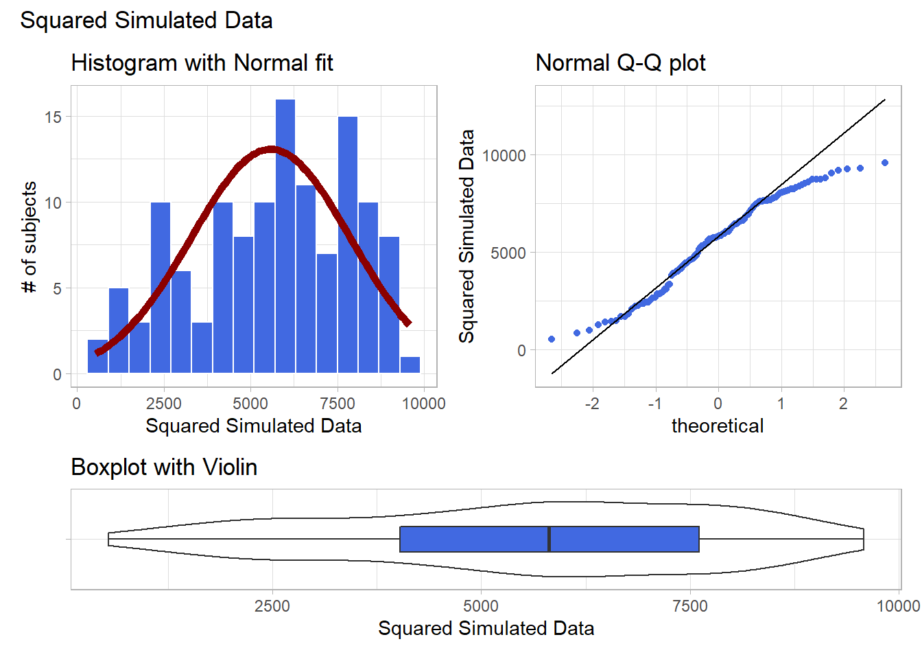
Looks like at best a modest improvement. How about cubing the data, instead?
res <- mosaic::favstats(~ sample2^3, data = data2)
bin_w <- 100000 # specify binwidth

p1 <- ggplot(data2, aes(x = sample2^3)) +
    geom_histogram(binwidth = bin_w,
                   fill = "royalblue",
                   col = "white") +
    theme_light() +
    stat_function(
        fun = function(x) dnorm(x, mean = res$mean,
                                sd = res$sd) *
            res$n * bin_w,
        col = "darkred", size = 2) +
    labs(title = "Histogram with Normal fit",
         x = "Cubed Simulated Data", y = "# of subjects")


p2 <- ggplot(data2, aes(sample = sample2^3)) +
    geom_qq(col = "royalblue") +
    geom_qq_line(col = "black") +
    theme_light() +
    labs(title = "Normal Q-Q plot",
         y = "Cubed Simulated Data")

p3 <- ggplot(data2, aes(x = "", y = sample2^3)) +
    geom_violin() +
    geom_boxplot(width = 0.3, fill = "royalblue",
                 outlier.color = "royalblue") +
    theme_light() +
    coord_flip() +
    labs(title = "Boxplot with Violin",
         x = "", y = "Cubed Simulated Data")

p1 + p2 - p3 + plot_layout(ncol = 1, height = c(3, 1)) +
    plot_annotation(title = "Cubed Simulated Data")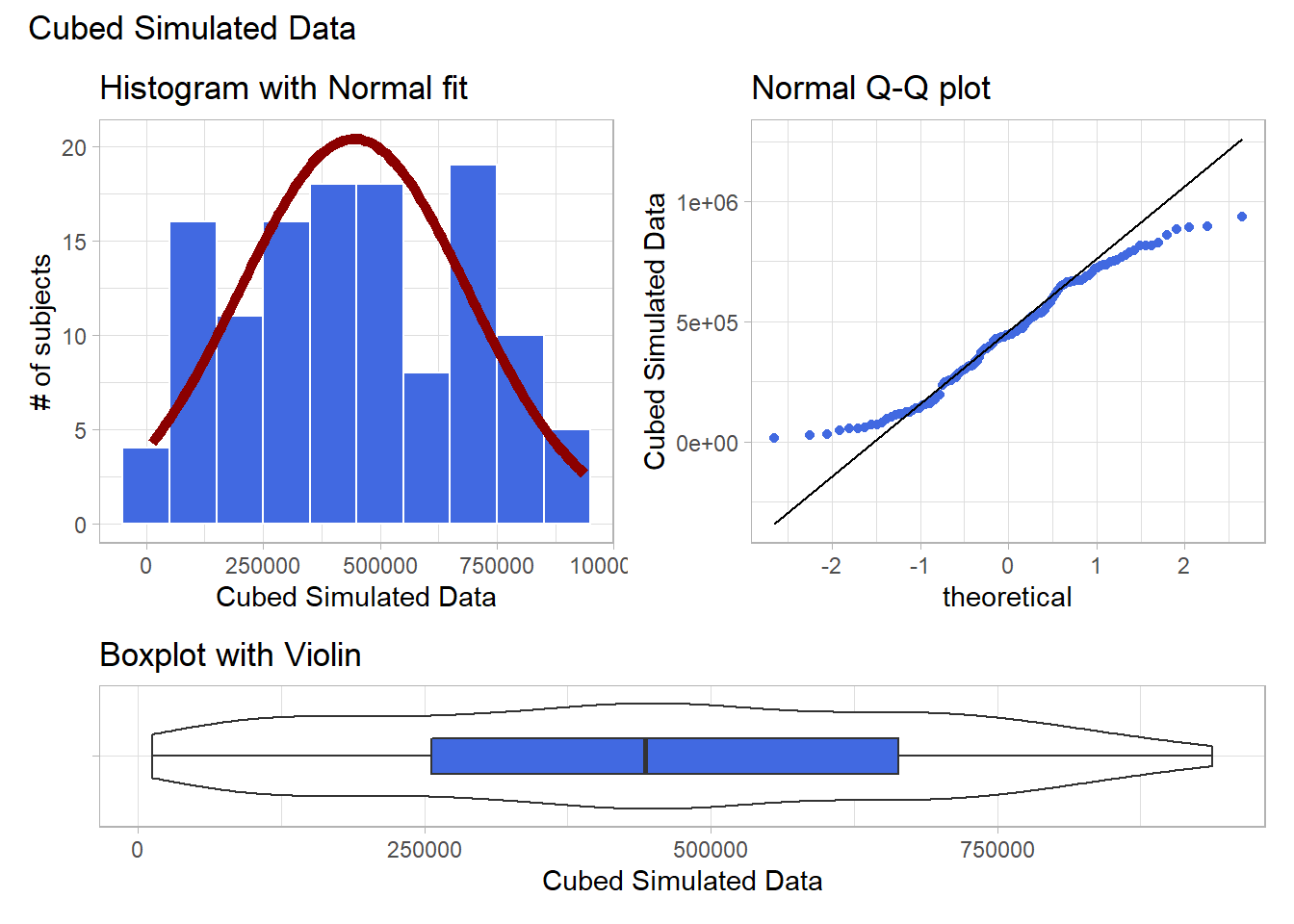
The newly transformed (cube of the) data appears more symmetric, although somewhat light-tailed. Perhaps a Normal model would be more appropriate now, although the standard deviation is likely to overstate the variation we see in the data due to the light tails. Again, I wouldn’t be thrilled using a cube in practical work, as it is so hard to interpret, but it does look like a reasonable choice here.
9.7 What if we considered all 9 available transformations?
p1 <- ggplot(data2, aes(sample = sample2^3)) +
    geom_qq(col = "royalblue") +
    geom_qq_line(col = "black") +
    theme_light() +
    labs(title = "Cube (power 3)")

p2 <- ggplot(data2, aes(sample = sample2^2)) +
    geom_qq(col = "royalblue") +
    geom_qq_line(col = "black") +
    theme_light() +
    labs(title = "Square (power 2)")

p3 <- ggplot(data2, aes(sample = sample2)) +
    geom_qq(col = "royalblue") +
    geom_qq_line(col = "black") +
    theme_light() +
    labs(title = "Original Data")

p4 <- ggplot(data2, aes(sample = sqrt(sample2))) +
    geom_qq(col = "royalblue") +
    geom_qq_line(col = "black") +
    theme_light() +
    labs(title = "sqrt (power 0.5)")

p5 <- ggplot(data2, aes(sample = log(sample2))) +
    geom_qq(col = "royalblue") +
    geom_qq_line(col = "black") +
    theme_light() +
    labs(title = "log (power 0)")

p6 <- ggplot(data2, aes(sample = sample2^(0.5))) +
    geom_qq(col = "royalblue") +
    geom_qq_line(col = "black") +
    theme_light() +
    labs(title = "1/sqrt (power -0.5)")

p7 <- ggplot(data2, aes(sample = 1/sample2)) +
    geom_qq(col = "royalblue") +
    geom_qq_line(col = "black") +
    theme_light() +
    labs(title = "Inverse (power -1)")

p8 <- ggplot(data2, aes(sample = 1/(sample2^2))) +
    geom_qq(col = "royalblue") +
    geom_qq_line(col = "black") +
    theme_light() +
    labs(title = "1/Square (power -2)")

p9 <- ggplot(data2, aes(sample = 1/(sample2^3))) +
    geom_qq(col = "royalblue") +
    geom_qq_line(col = "black") +
    theme_light() +
    labs(title = "1/Cube (power -3)")


p1 + p2 + p3 + p4 + p5 + p6 + p7 + p8 + p9 +
    plot_layout(nrow = 3) +
    plot_annotation(title = "Transformations of Simulated Sample")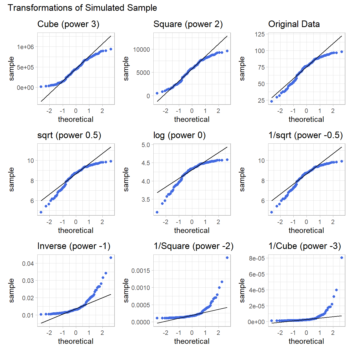
Again, either the cube or the square looks like best choice here, in terms of creating a more symmetric (albeit light-tailed) distribution.