2 Graphical Summaries
2.1 R setup for this chapter
This section loads all needed R packages for this chapter. Appendix A lists all R packages used in this book, and also provides R session information.
2.2 Data from an R package: The Palmer Penguins
Appendix C provides further guidance on pulling data from other systems into R, while Appendix D gives more information (including download links) for all data sets used in this book.
The data in the palmerpenguins package includes several measurements of interest for adult foraging penguins observed on islands in the Palmer Archipelago near Palmer Station, Antarctica. Dr. Kristen Gorman and the Palmer Station Long Term Ecological Research (LTER) Program collected the data and made them available1. The data describe three species of penguins, called Adelie, Chinstrap and Gentoo. See Horst, Hill, and Gorman (2020) for more details on the palmerpenguins package and data.
Once we’ve used the library() function to load in the palmerpenguins package, a data set will become available called penguins. To view it, we can simply type in the name.
penguins# A tibble: 344 × 8
species island bill_length_mm bill_depth_mm flipper_length_mm body_mass_g
<fct> <fct> <dbl> <dbl> <int> <int>
1 Adelie Torgersen 39.1 18.7 181 3750
2 Adelie Torgersen 39.5 17.4 186 3800
3 Adelie Torgersen 40.3 18 195 3250
4 Adelie Torgersen NA NA NA NA
5 Adelie Torgersen 36.7 19.3 193 3450
6 Adelie Torgersen 39.3 20.6 190 3650
7 Adelie Torgersen 38.9 17.8 181 3625
8 Adelie Torgersen 39.2 19.6 195 4675
9 Adelie Torgersen 34.1 18.1 193 3475
10 Adelie Torgersen 42 20.2 190 4250
# ℹ 334 more rows
# ℹ 2 more variables: sex <fct>, year <int>For example, the first row describes a penguin of the Adelie species, from the island of Torgeson, with a bill length of 39.1 mm, and so forth.
The penguins data are represented in R using a tibble, a special type of R data frame that prints only the first ten rows of our data, and has some other attractive features, as compared to regular R data frames.
Within the penguins tibble, we see 344 rows, each representing a different penguins and 8 columns, each representing a different variable which helps characterize the penguins. In all, the data contain eight variables (columns) which describe each penguin’s:
- species (Adelie, Chinstrap or Gentoo)
- island (Biscoe, Dream or Torgerson)
- bill length, in mm
- bill depth, in mm
- flipper length, in mm
- body mass, in g
- sex (either female or male, although we’ll see that some of the rows are missing this information)
- year of observation (either 2007, 2008 or 2009)
There are also some rows which contain indicators of missing data - these are the NA values we see, for example, in the data for the fourth penguin. It will turn out that missingness in the penguins tibble is confined to the variables describing the size and sex of the penguins.
2.3 What is in our tibble?
How many rows and columns are there in the penguins tibble?
There are many ways to get a quick understanding of what’s contained in the penguins tibble, including glimpse() (shown below) as well as str() and data_peek(). Each of these provides similar information on the types of variables (factors, integers, numbers) and some of their values in the tibble.
str(penguins)tibble [344 × 8] (S3: tbl_df/tbl/data.frame)
$ species : Factor w/ 3 levels "Adelie","Chinstrap",..: 1 1 1 1 1 1 1 1 1 1 ...
$ island : Factor w/ 3 levels "Biscoe","Dream",..: 3 3 3 3 3 3 3 3 3 3 ...
$ bill_length_mm : num [1:344] 39.1 39.5 40.3 NA 36.7 39.3 38.9 39.2 34.1 42 ...
$ bill_depth_mm : num [1:344] 18.7 17.4 18 NA 19.3 20.6 17.8 19.6 18.1 20.2 ...
$ flipper_length_mm: int [1:344] 181 186 195 NA 193 190 181 195 193 190 ...
$ body_mass_g : int [1:344] 3750 3800 3250 NA 3450 3650 3625 4675 3475 4250 ...
$ sex : Factor w/ 2 levels "female","male": 2 1 1 NA 1 2 1 2 NA NA ...
$ year : int [1:344] 2007 2007 2007 2007 2007 2007 2007 2007 2007 2007 ...The naniar package provides us with several ways to identify and count missing values in the data. For instance, the penguins tibble contains 19 missing values.
n_miss(penguins)[1] 19Which variables contain missing values?
miss_var_summary(penguins)# A tibble: 8 × 3
variable n_miss pct_miss
<chr> <int> <num>
1 sex 11 3.20
2 bill_length_mm 2 0.581
3 bill_depth_mm 2 0.581
4 flipper_length_mm 2 0.581
5 body_mass_g 2 0.581
6 species 0 0
7 island 0 0
8 year 0 0 We can also break down missing values within each observation (or case) in the data.
miss_case_table(penguins)# A tibble: 3 × 3
n_miss_in_case n_cases pct_cases
<int> <int> <dbl>
1 0 333 96.8
2 1 9 2.62
3 5 2 0.581Here, for instance, we see 2 rows (penguins) each missing five values, 9 missing just 1, and the remaining 333 are complete.
2.4 Visualizing A Quantity
There is no single best way to display a data set. Looking at data in unexpected ways can lead to discovery. – Gelman, Hill, and Vehtari (2021)
Let’s look at some fundamental ways of plotting data describing the distribution of one of our variables. We’ll start with the flipper length, measured in mm. We will make use of the ggplot2 package, which is part of the tidyverse meta-package, to construct our plots.
2.4.1 Histogram
Here, for example, is a histogram of the flipper lengths for our penguins. Note that we first specify the tibble (data frame = penguins, here), and then the x axis (flipper lengths), before creating the histogram with navy blue fill in each bar, and yellow lines around the bar.
ggplot(data = penguins, aes(x = flipper_length_mm)) +
  geom_histogram(fill = "navy", col = "yellow")
`stat_bin()` using `bins = 30`. Pick better value `binwidth`.Warning: Removed 2 rows containing non-finite outside the scale range
(`stat_bin()`).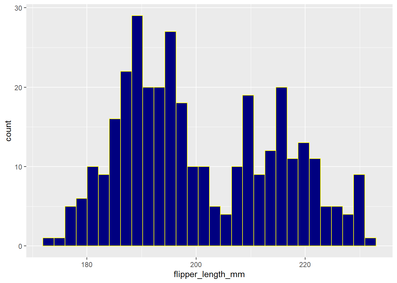
This code produces both a message (which we might ignore) and a warning (which is more worrisome.)
- The warning alerts us that two rows have not been plotted, and this is because we have missing values for flipper length for two of our penguins. So, perhaps we should filter our data down to only those penguins with complete information on flipper length.
- The message suggests that we ought to specify the number of bins (bars) in which we divide the flipper lengths. We can do so by either specifying a bin width or the number of bins.
We address each of these concerns (and adjust a few other things) in the revised histogram shown below.
penguins |>
  filter(complete.cases(flipper_length_mm)) |>
  ggplot(aes(x = flipper_length_mm)) +
  geom_histogram(bins = 20, fill = "#003071", color = "#ACD2E6") +
  labs(
    x = "Flipper Length, in mm",
    title = "Revised Histogram of Flipper Length"
  ) +
  theme_lucid()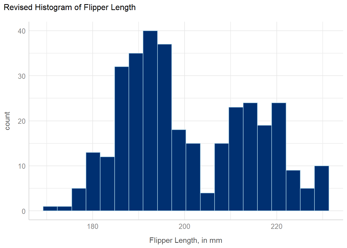
- To eliminate the penguins with missing information on flipper length, we filtered the data to only contain the cases (rows) with complete information on the
flipper_length_mmvariable. We’ll use complete case approaches to deal with missingness for a while, until Section 16.6. - The new color scheme follows CWRU’s branding (visual identity) found at https://case.edu/brand/visual-identity/color. Specifically, we’ve used hexadecimal notation to identify CWRU Blue (HEX 003071) and CWRU Light Blue (HEX A6D2E6) as our desired fill and color, respectively.
- We’ve used a different theme than the default ggplot2 choice, called
theme_lucid()which happens to be a favorite of mine. (My other favorite, used in most of this book, istheme_bw()which is very similar.) This results in a change in the background color from gray to white, among other things. - We’ve also adjusted the x-axis label and added a main title to the plot.
2.4.2 Histogram with Normal Curve
Sometimes we might want to build a histogram with a curve superimposed to show what a Normal (or Gaussian) distribution with the same mean and standard deviation might be. My favorite way to do this is shown below.
bw = 4 # specify width of bins in histogram

ggplot(penguins, aes(x = flipper_length_mm)) +
  geom_histogram(binwidth = bw,
                 fill = "black", col = "yellow") +
  stat_function(fun = function(x)
    dnorm(x, mean = mean(penguins$flipper_length_mm,
                         na.rm = TRUE),
          sd = sd(penguins$flipper_length_mm,
                  na.rm = TRUE)) *
      length(penguins$flipper_length_mm) * bw,
    geom = "area", alpha = 0.5,
    fill = "lightblue", col = "blue") +
  theme_lucid()
Warning: Removed 2 rows containing non-finite outside the scale range
(`stat_bin()`).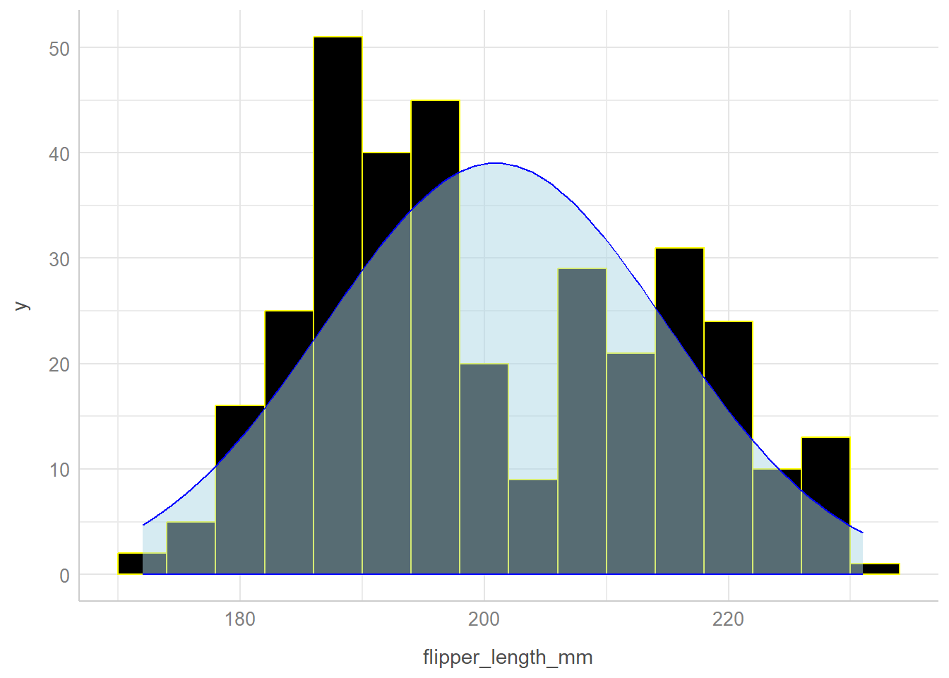
2.4.3 An alternative approach
Another way to do this produces a histogram using some tools from the easystats family of R packages, but the underlying plot is still a ggplot2 plot, which can be adjusted in the same way as another such plot.
result <- describe_distribution(penguins$flipper_length_mm)

plot(result, centrality = "mean", dispersion = TRUE,
  dispersion_style = "curve"
) +
  labs(x = "Flipper Length in mm") +
  theme_lucid()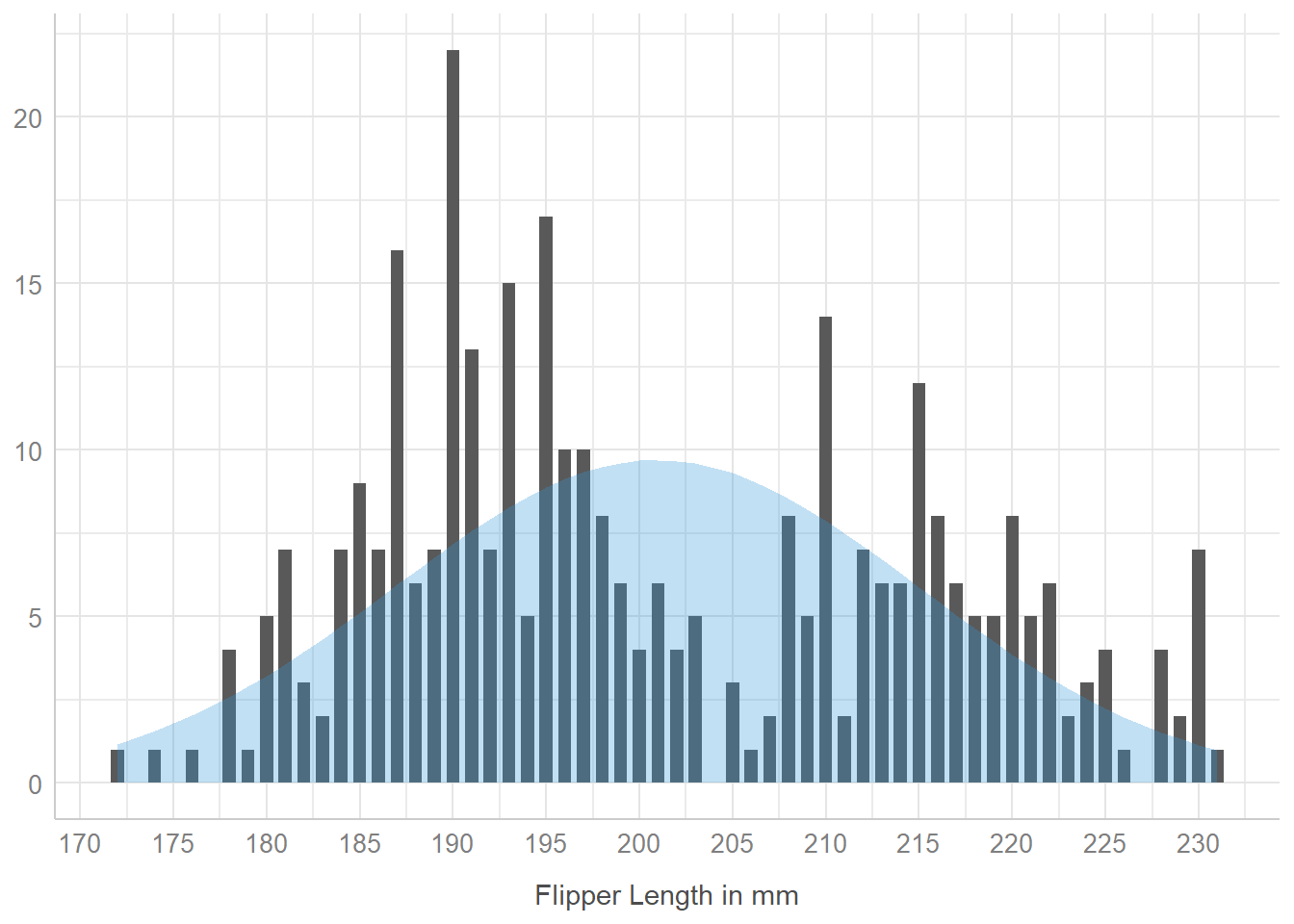
On the good side, the plot() function used here already (by default) removes any missing values of flipper length before plotting.
On the bad side, I don’t know of a way to adjust the binwidths in this plot, which is something I prefer to be able to control. Hence, I generally use my approach.
2.4.4 Boxplot
penguins |>
  filter(complete.cases(flipper_length_mm)) |>
  ggplot(aes(x = flipper_length_mm, y = "")) +
  geom_boxplot(fill = "royalblue", color = "black") +
  stat_summary(
    fun = mean, geom = "point",
    shape = 16, size = 3, col = "white"
  ) +
  labs(
    x = "Flipper Length, in mm", y = "",
    title = "Boxplot of Penguin Flipper Lengths",
    subtitle = "White dot is the sample mean"
  ) +
  theme_bw()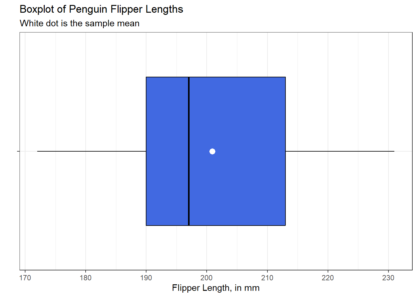
This boxplot shows the middle 50% of the data (from the 25th percentile to the 75th percentile) as a box, with a vertical line in the middle indicating the median of the data (the 50th percentile.) The “whiskers” extend from the box out to the most extreme values seen in the data which do not qualify as potential outliers (unusual values) using a method due to Tukey (1977) and described in this book as part of Section 3.5.
I like to add an indication of the location of the sample mean of the data to my boxplots, so I have done so here.
The values plotted by this boxplot can be identified using the following R code:
fivenum(penguins$flipper_length_mm)[1] 172 190 197 213 231mean(penguins$flipper_length_mm, na.rm = TRUE)[1] 200.9152There are many ways to extend the fundamental idea of a boxplot. Here, for example, is a somewhat fancier option, now looking at the body mass (in g) of the penguins.
penguins |>
  filter(complete.cases(body_mass_g)) |>
  ggplot(aes(x = body_mass_g, y = "")) +
  geom_violin(fill = "royalblue") +
  geom_boxplot(width = 0.3, color = "black") +
  stat_summary(
    fun = mean, geom = "point",
    shape = 16, size = 3, col = "red"
  ) +
  geom_rug() +
  labs(
    x = "Body Mass, in g", y = "",
    title = "Penguin Body Mass, in grams",
    subtitle = "Boxplot with Violin and Rug",
    caption = "Palmer Penguins, with 2 missing observations excluded."
  ) +
  theme_bw()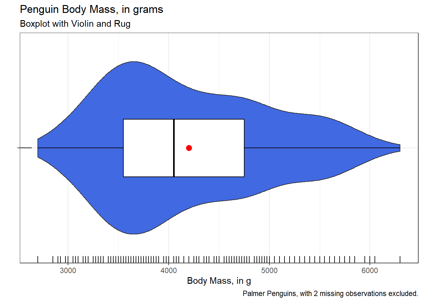
2.4.5 Normal Q-Q Plot
As it turns out, it will often be useful for us to consider whether or not a data set is well fit by a Normal distribution (sometimes called a Gaussian distribution.) One important tool for doing this is called a Normal probability plot or Normal Q-Q plot.
The Central Limit Theorem from probability tells us that the sum of many small, independent random variables will produce a variable which approximated the Normal distribution. As a result, data that can be thought of as sums of many smaller additive factors often approximate a Normal distribution.
A major appeal of the Normal distribution is that data that are Normally distributed can be well summarized by the mean and standard deviation of the sample.
A Normal Q-Q plot will follow a straight line when the data are (approximately) Normally distributed. When the data have a different shape, the plot will reflect that. The purpose of a Normal Q-Q plot is to help point out distinctions from a Normal distribution. A Normal distribution is symmetric and has certain expectations regarding its tails. The Normal Q-Q plot can help us identify data as well approximated by a Normal distribution, or not, because of:
- skew (including distinguishing between right skew and left skew) which is indicated by monotonic curves away from a straight line in the Normal Q-Q plot
- behavior in the tails (which could be heavy-tailed [more outliers than expected, shown as reverse “s” shapes] or light-tailed [shown as “s” shapes in the plot.])
penguins_cc <- penguins |>
  drop_na()

ggplot(penguins_cc, aes(sample = body_mass_g)) +
  geom_qq() +
  geom_qq_line(col = "red") +
  labs(
    y = "Body Mass in grams",
    x = "Standard Normal Distribution",
    title = "Palmer Penguins: Body Mass"
  ) +
  theme_lucid()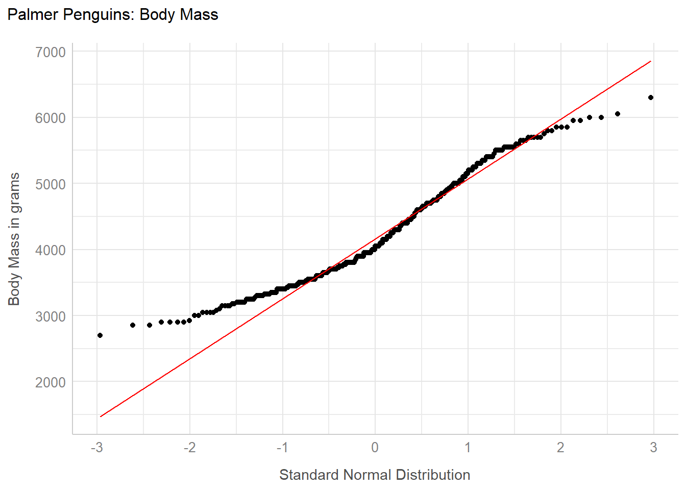
Here we see the points at the left of the plot curve above the red line, and the points at the right curve below the red line. This is the “s” shape I mentioned earlier, which indicates data that are somewhat more light-tailed than we’d expect from a Normal distribution.
Below are a couple of additional examples of Normal Q-Q plots in the penguins data, next to histograms to help us better understand the shape of a distribution.
dat1 <- penguins_cc |>
  filter(species == "Adelie")

p1 <- ggplot(dat1, aes(sample = bill_length_mm)) +
  geom_qq(col = "navy") +
  geom_qq_line(col = "red") +
  labs(
    y = "Bill Length in mm",
    x = "Standard Normal Distribution"
  ) +
  theme_bw()

p2 <- ggplot(dat1, aes(x = bill_length_mm)) +
  geom_histogram(bins = 10, col = "yellow", fill = "navy") +
  theme_bw()

p1 + p2 +
  plot_annotation(title = "Approximately Normal Distribution")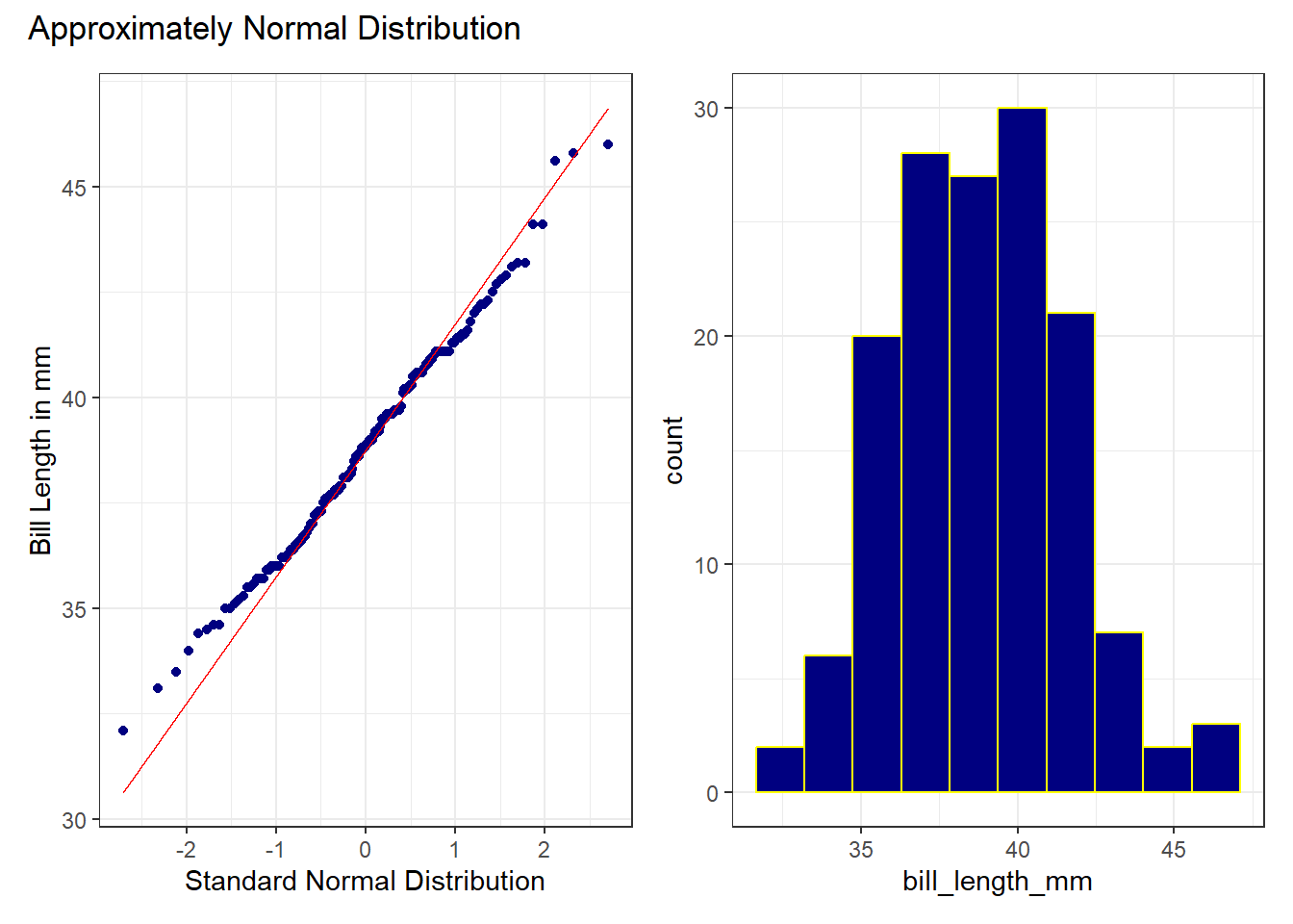
While the Normal distribution isn’t a perfect fit to these data, the points are generally quite close to the red line in the Normal Q-Q plot, and we see a mostly symmetric histogram to back up this finding.
dat2 <- penguins_cc |>
  filter(island == "Biscoe")

p3 <- ggplot(dat2, aes(sample = bill_depth_mm)) +
  geom_qq(col = "forestgreen") +
  geom_qq_line(col = "red") +
  labs(
    y = "Bill Depth in mm",
    x = "Standard Normal Distribution"
  ) +
  theme_bw()

p4 <- ggplot(dat2, aes(x = bill_depth_mm)) +
  geom_histogram(bins = 15, col = "white", fill = "forestgreen") +
  theme_bw()

p3 + p4 +
  plot_annotation(title = "Right Skewed Distribution")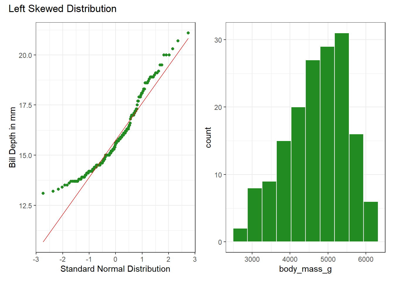
Here, note that the points at the left and right side of the Normal Q-Q plot bend up away from the curve (more so at the bottom of the distribution) and this indicates skew.
2.4.6 Three Plots at Once
Seeing more than one representation of the data at a time can help us use each to say something about the center, spread and shape of the distribution. The patchwork package allows us to place multiple plots into a single figure, as follows:
bw = 4 # specify width of bins in histogram

p1 <- ggplot(penguins, aes(x = bill_length_mm)) +
  geom_histogram(binwidth = bw,
                 fill = "black", col = "yellow") +
  stat_function(fun = function(x)
    dnorm(x, mean = mean(penguins$bill_length_mm,
                         na.rm = TRUE),
          sd = sd(penguins$bill_length_mm,
                  na.rm = TRUE)) *
      length(penguins$bill_length_mm) * bw,
    geom = "area", alpha = 0.5,
    fill = "lightblue", col = "blue"
    ) +
  labs(
    x = "Bill Length in mm",
    title = "Histogram & Normal Curve"
  ) +
  theme_bw()

p2 <- ggplot(penguins_cc, aes(sample = bill_length_mm)) +
  geom_qq() +
  geom_qq_line(col = "red") +
  labs(
    y = "Bill Length in mm",
    x = "Standard Normal Distribution",
    title = "Normal Q-Q plot"
  ) +
  theme_bw()

p3 <- ggplot(penguins_cc, aes(x = bill_length_mm, y = "")) +
  geom_violin(fill = "cornsilk") +
  geom_boxplot(width = 0.2) +
  stat_summary(
    fun = mean, geom = "point",
    shape = 16, col = "red"
  ) +
  labs(
    y = "", x = "Bill Length in mm",
    title = "Boxplot with Violin"
  ) +
  theme_bw()

p1 + (p2 / p3 + plot_layout(heights = c(2, 1))) +
  plot_annotation(
    title = "Palmer Penguins: Bill Length in mm"
  )
Warning: Removed 2 rows containing non-finite outside the scale range
(`stat_bin()`).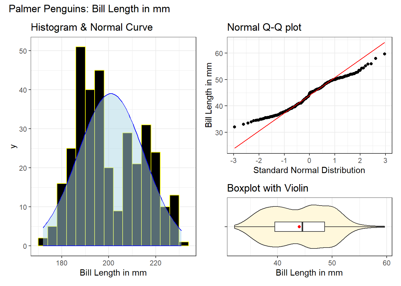
Here, we have a histogram with a superimposed Normal distribution curve, a Normal Q-Q plot, and a boxplot with violin to choose from, each describing the bill lengths in mm for all of the penguins with data on this measure.
- The histogram shows fewer observations near the mean of the data, but more (on both sides) as we move towards the tails. The edges of the distribution appear to have lighter tails than we’d expect if these data were Normally distributed.
- The S shape in the Normal Q-Q plot suggests symmetric but light-tailed data as compared to a Normal distribution.
- We see a lack of outliers in the boxplot, with the mean and median fairly close to one another, which indicates some symmetry but light-tailed shape.
2.4.7 Stem-and-Leaf Display
Prior to computers, a stem-and-leaf display was a useful tool for sorting through a batch of data by hand in a way that left you with an approximate histogram of the data values. I include it here out of nostalgia, primarily.
stem(penguins_cc$bill_depth_mm)
  The decimal point is at the |

  13 | 1234
  13 | 5567777778889999
  14 | 001112222223334444
  14 | 5555555566666778889
  15 | 00000000001112222333344
  15 | 5566677777888899999
  16 | 0000111111222333344
  16 | 555566666677888899
  17 | 0000000000001111111222222333333334
  17 | 5555556666778888888889999999999
  18 | 000001111111122222333344444
  18 | 55555555556666666666777777888888899999999
  19 | 0000000001111122223344444
  19 | 55555566677888999
  20 | 0000001333
  20 | 567778
  21 | 11122
  21 | 5
We see that the minimum bill depth is 13.1 and the maximum is 21.5.
Here’s another stem-and-leaf display. Note the change in the location of the decimal point.
stem(penguins_cc$flipper_length_mm)
  The decimal point is 1 digit(s) to the right of the |

  17 | 24
  17 | 68888
  18 | 00001111111222334444444
  18 | 55555555566666677777777777777778888889999999
  19 | 000000000000000000000111111111111122222223333333333333344444
  19 | 555555555555555556666666666777777777788888888999999
  20 | 0000111111222233333
  20 | 5556778888888899999
  21 | 0000000000000011222222233333344444
  21 | 555555555555666666777778888899999
  22 | 000000001111122222233444
  22 | 55556888899
  23 | 00000001
The minimum flipper_length is 172 mm and the maximum is 231.
2.5 Comparing Multiple Quantities
2.5.1 Faceted Histograms
ggplot(data = penguins_cc, aes(x = bill_depth_mm)) +
  geom_histogram(bins = 20, fill = "#003071", color = "#ACD2E6") +
  facet_grid(island ~ .) +
  labs(
    x = "Bill Depth, in mm",
    title = "Bill Depth of Palmer Penguins, by Island"
  ) +
  theme_bw()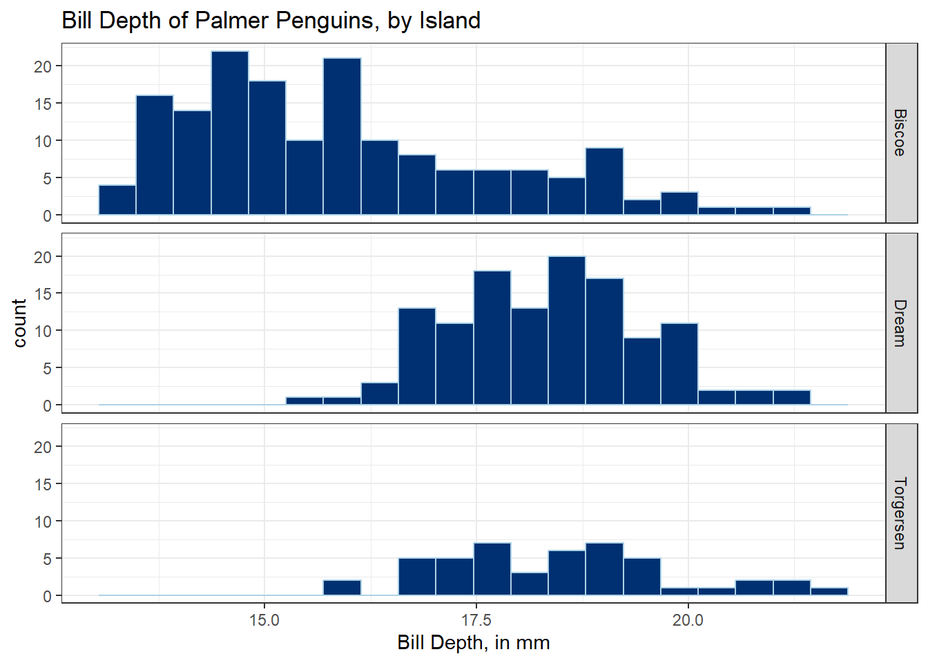
2.5.2 Overlapping Histograms
gghistogram(penguins_cc,
  x = "bill_depth_mm",
  add = "mean", rug = TRUE, bins = 20,
  color = "sex", fill = "sex",
  palette = c("#00AFBB", "#E7B800")
)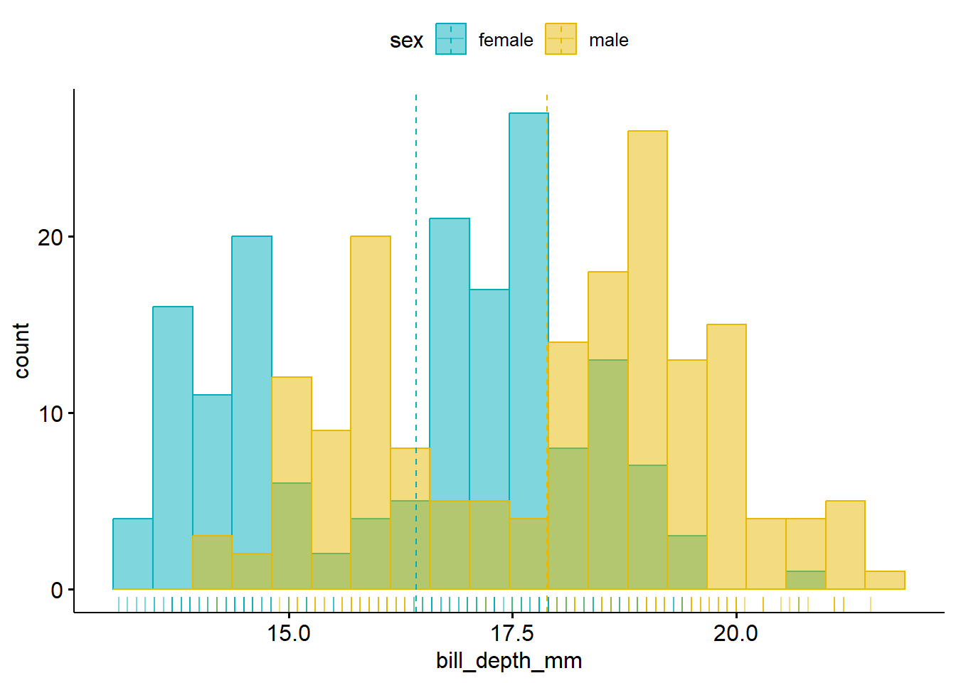
The gghistogram() function comes from the ggpubr package. Read more about its approaches to plotting distributions at https://rpkgs.datanovia.com/ggpubr/#distribution.
2.5.3 Comparison Boxplot, by Island
ggplot(
  data = penguins_cc,
  aes(x = bill_length_mm, y = island)
) +
  geom_boxplot() +
  stat_summary(
    fun = mean, geom = "point",
    shape = 16, size = 3, col = "red"
  ) +
  theme_bw()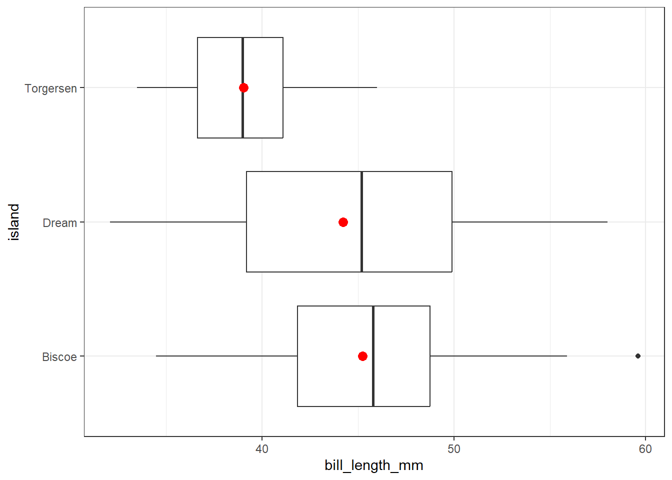
The penguins coming from Torgeson island appear to have shorter bill lengths than do the penguins from the other two islands. Note also that there is a dot (indicating a potential outlier) in the Biscoe data, outside the whiskers for that plot. More on outliers in Section 3.5.
2.5.4 Adding Summary Statistics
ggsummarystats(
  penguins_cc,
  x = "species", y = "bill_length_mm",
  ggfunc = ggboxplot, add = "jitter",
  color = "species", palette = "npg"
)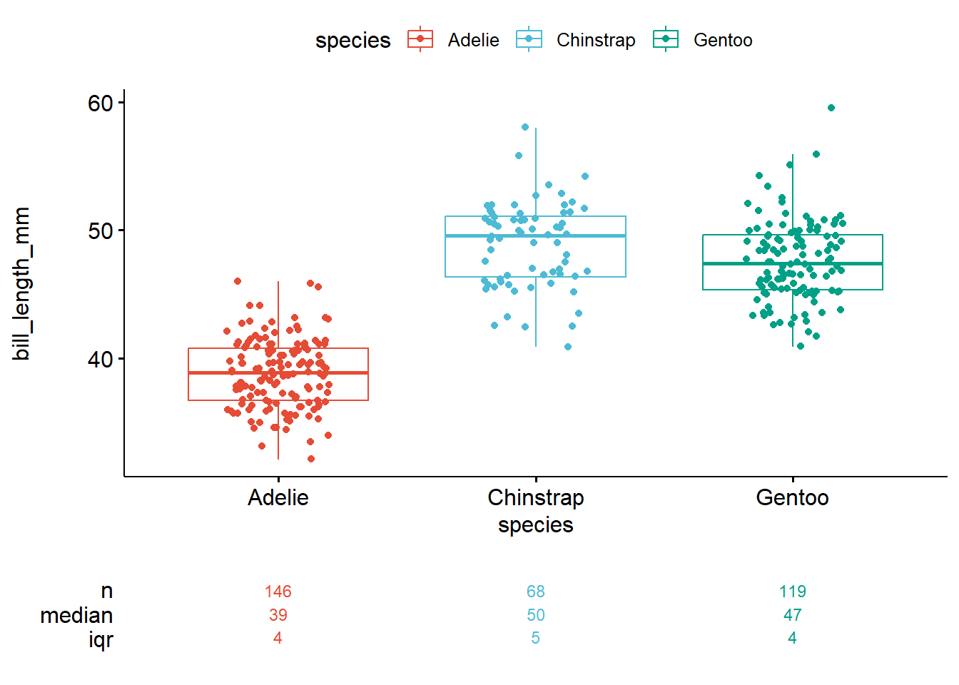
Adelie penguins appear smaller, on average, than do the penguins of the other two species.
The ggsummarystats() tool is part of the ggpubr package, and more details on this tool are available here.
2.5.5 Box and Violin Plot, by Species
ggplot(
  data = penguins_cc,
  aes(y = body_mass_g, x = species)
) +
  geom_violin(aes(fill = species)) +
  geom_boxplot(width = 0.2, notch = TRUE) +
  stat_summary(
    fun = mean, geom = "point",
    shape = 16, size = 3, col = "red"
  ) +
  scale_fill_viridis_d(
    option = "turbo", begin = 0.3,
    alpha = 0.5
  ) +
  guides(fill = "none") +
  theme_bw()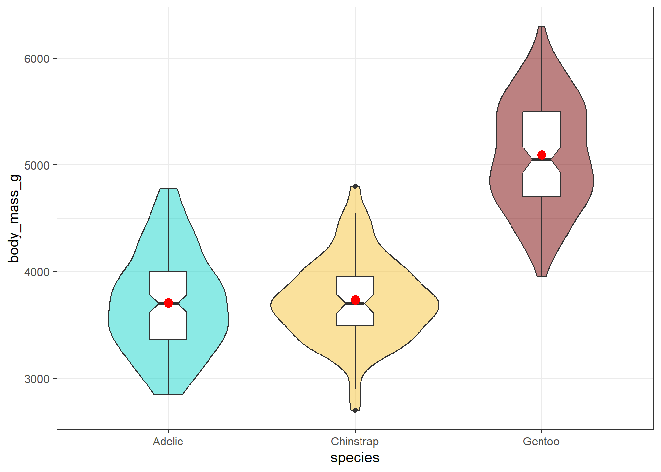
We have included a notch in each boxplot here to help compare the groups. The idea is that if the notches of two boxes do not overlap, this suggests a fairly large difference in the medians of the two groups. Here, this just provides a little more information to suggest that the Gentoo penguins have larger body mass than either of the other two species.
2.5.6 Rain Cloud Plot, by Species
A rain cloud plot is another way of visualizing the distributions of several groups on the same outcome simultaneously.
ggplot(
  data = penguins_cc,
  aes(
    y = species, x = bill_length_mm,
    fill = species
  )
) +
  stat_slab(aes(thickness = after_stat(pdf * n)), scale = 0.7) +
  stat_dotsinterval(side = "bottom", scale = 0.7, slab_linewidth = NA) +
  scale_fill_brewer(palette = "Set2") +
  guides(fill = "none") +
  theme_bw()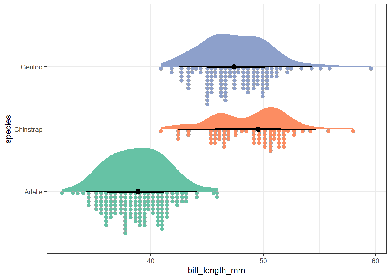
At the top of the plot is a half-violin plot, which displays a smoothed estimate of the values in the data. On the bottom, a dot chart shows the individual values grouped into small bins. In between, we show a dot at the group median, surrounded by a set of quantile intervals. The broader line shows an interval covering the middle 66% of the data, while the finer line shows an interval covering the middle 95% of the data.
This implementation of rain cloud plots comes to us from the ggdist package, which contains several tools to help plot distributions and uncertainty. More information from that site on rain cloud plots and related options is available here.
2.6 Scatterplots of Associations
When reporting data and analysis, you should always imagine yourself in the position of the reader of the report. – Gelman, Hill, and Vehtari (2021)
2.6.1 Building a basic scatterplot
ggplot(
  data = penguins_cc,
  aes(x = flipper_length_mm, y = body_mass_g)
) +
  geom_point()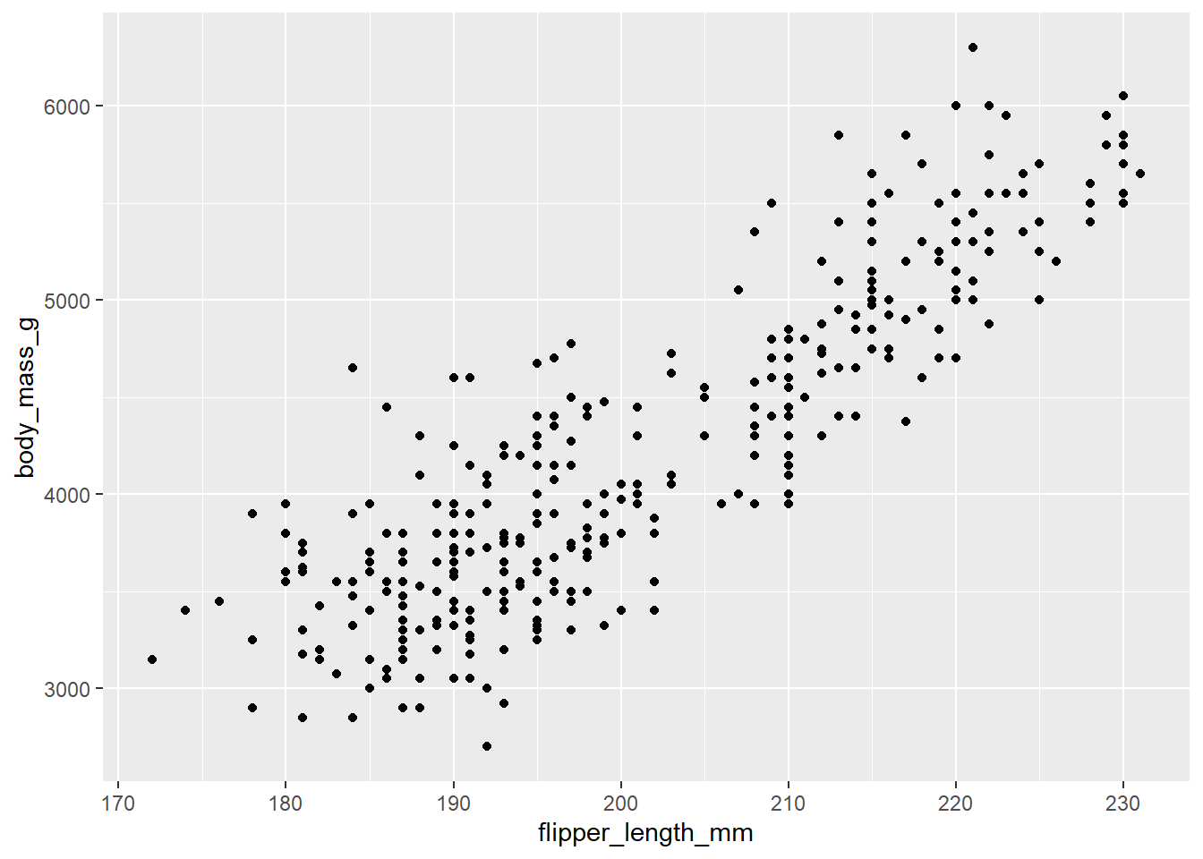
We see here a generally increasing relationship between these variables. On average, penguins with larger flipper lengths tend to have larger body mass.
2.6.2 Adding a straight line fit
The method of least squares (among other approaches) can be used to identify the intercept (value of y when x = 0) and slope (amount that y increases when x increases by 1) of a fitted line. In building a scatterplot, we can add this line by adding a call to geom_smooth() asking for a linear model (fit with lm), as follows:
ggplot(
  data = penguins_cc,
  aes(x = flipper_length_mm, y = body_mass_g)
) +
  geom_point() +
  geom_smooth(
    method = "lm",
    formula = y ~ x, se = TRUE,
    col = "red"
  ) +
  theme_bw()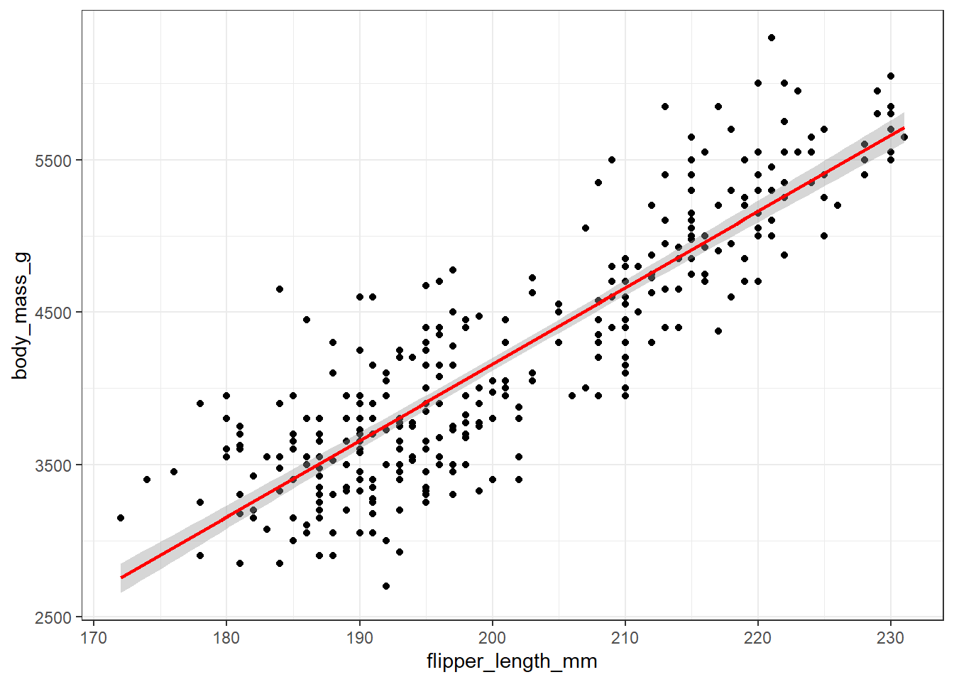
The straight line fit through the data here uses the method of least squares. The line is selected to minimize the sum of the squared vertical distance (on the y-axis) from the data points to the regression line. For now, it’s important to realize that this least squares line always goes through the point at the mean of our x variable (here, flipper length) and the mean of our y variable (here, body mass.)
The positive slope of this association again indicates that, in general, penguins with larger flipper lengths also have larger body masses.
If you’re interested, the equation for the slope and intercept of a least squares line fit to a scatter plot like this is found in Appendix E.
In the R code above, we’re including a request that a ribbon be plotted (with se = TRUE) around the regression line, to give us some idea of how much uncertainty we should perceive around the positioning of that line.
2.6.3 Adding the fitted equation
ggplot(
  data = penguins_cc,
  aes(x = flipper_length_mm, y = body_mass_g)
) +
  geom_point() +
  geom_smooth(
    method = "lm",
    formula = y ~ x, se = TRUE,
    col = "red"
  ) +
  stat_regline_equation() +
  stat_cor(aes(label = after_stat(rr.label)),
    label.x = 172, label.y = 5800
  ) +
  theme_bw()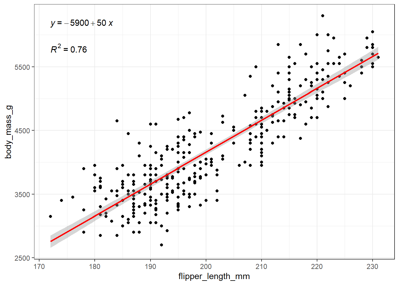
Also, our model’s \(R^2\) value is 76%, or 0.76.
The stat_regline_equation() and stat_cor() functions which place these results in the plot come from the ggpubr package. Additional details are available at the ggpubr website.
2.6.4 Interpreting the model’s \(R^2\) value
The \(R^2\) value above is the square of the Pearson correlation coefficient (see Appendix E for formulas), which we’ll return to when we study association in Chapter 10. For now, the \(R^2\) value can range from 0 to 1, with larger values indicating a stronger fit of the model to the data. We can interpret this \(R^2\) value as indicating that our linear regression model using flipper_length_mm as a predictor accounts for 76% of the variation in our outcome, body_mass_g.
The correlation coefficient, \(r_{xy}\) can be determined here by recognizing that it is the square root of \(R^2\) with the same sign as the slope of the regression line.
Here our regression line has a positive slope (in fact the slope is 50) and so the correlation coefficient \(r_{xy} = \sqrt{0.76} = +0.87\) will also be positive.
cor(
  penguins_cc$flipper_length_mm,
  penguins_cc$body_mass_g
)
[1] 0.87297892.6.5 Interpreting the Regression Equation
We have seen that our least squares regression estimate for these data is:
- body mass = -5900 + 50 flipper length + error.
The intercept here is not especially interesting. The value of -5900 estimates the average body mass of a penguin with a flipper length of 0 mm, and this is well beyond the range of our data2
The slope of the equation, on the other hand, is quite interesting. The safest and most sensible approach to describing a slope involves a comparison, for example:
“When comparing any two penguins who differ by 1 mm in flipper length, we observe a body mass that is, on average, 50 grams larger for the penguin with larger flipper length.”
or
“Under our fitted model, the average difference in body mass, comparing two penguins with a one mm difference in flipper length, is 50 grams.”
or
“If a penguin named Jack’s flipper length is one mm larger than a penguin named Harry, then on average, Jack’s body mass will be 50 grams larger than Harry’s, according to our model.”
It may be tempting to report that the estimated effect of one mm of flipper length on a penguin’s body mass is 50 grams, but we cannot justify that without many assumptions (related to causality) that don’t hold in this case.
The idea of an effect is really reserved for a change associated with some sort of treatment or intervention. But we don’t have the ability to intervene on penguins to make their flippers longer.
2.6.6 Add loess smooth
ggplot(
  data = penguins_cc,
  aes(x = flipper_length_mm, y = body_mass_g)
) +
  geom_point() +
  geom_smooth(method = "lm", formula = y ~ x, se = TRUE, col = "red") +
  geom_smooth(method = "loess", formula = y ~ x, se = FALSE, col = "blue") +
  theme_lucid()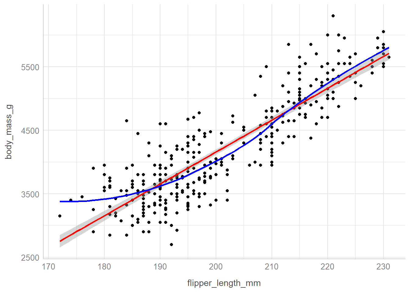
2.6.7 Smooths within each island
ggplot(
  data = penguins_cc,
  aes(
    x = flipper_length_mm, y = body_mass_g,
    col = island
  )
) +
  geom_point() +
  geom_smooth(
    method = "loess", formula = y ~ x, se = FALSE
  ) +
  scale_color_metro_d() +
  theme_bw()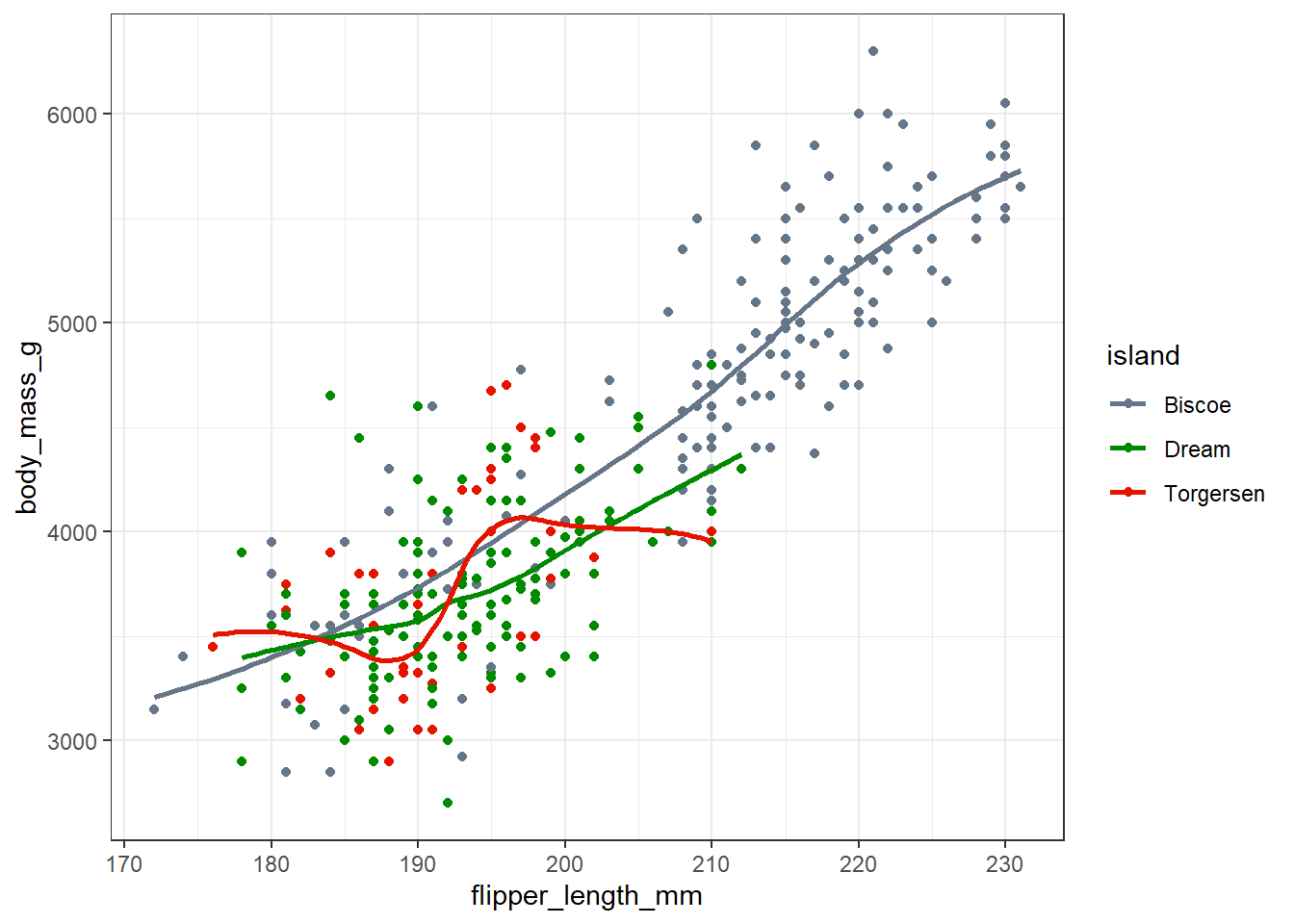
One thing we spot here is that we have a much broader range of flipper lengths in the penguins from Biscoe than in those from Dream or Torgeson, each of which seem to only have penguins with flippers between about 180 and 210 mm long.
For all three islands, we have a generally positive association between body mass and flipper length, especially in the Biscoe and Dream island groups.
2.6.8 Linear Model faceted by species
ggplot(
  data = penguins_cc,
  aes(
    x = flipper_length_mm, y = body_mass_g,
    col = species
  )
) +
  geom_point() +
  geom_smooth(method = "lm", formula = y ~ x, se = FALSE) +
  scale_color_metro_d() +
  facet_wrap(~species) +
  guides(color = "none") +
  theme_bw()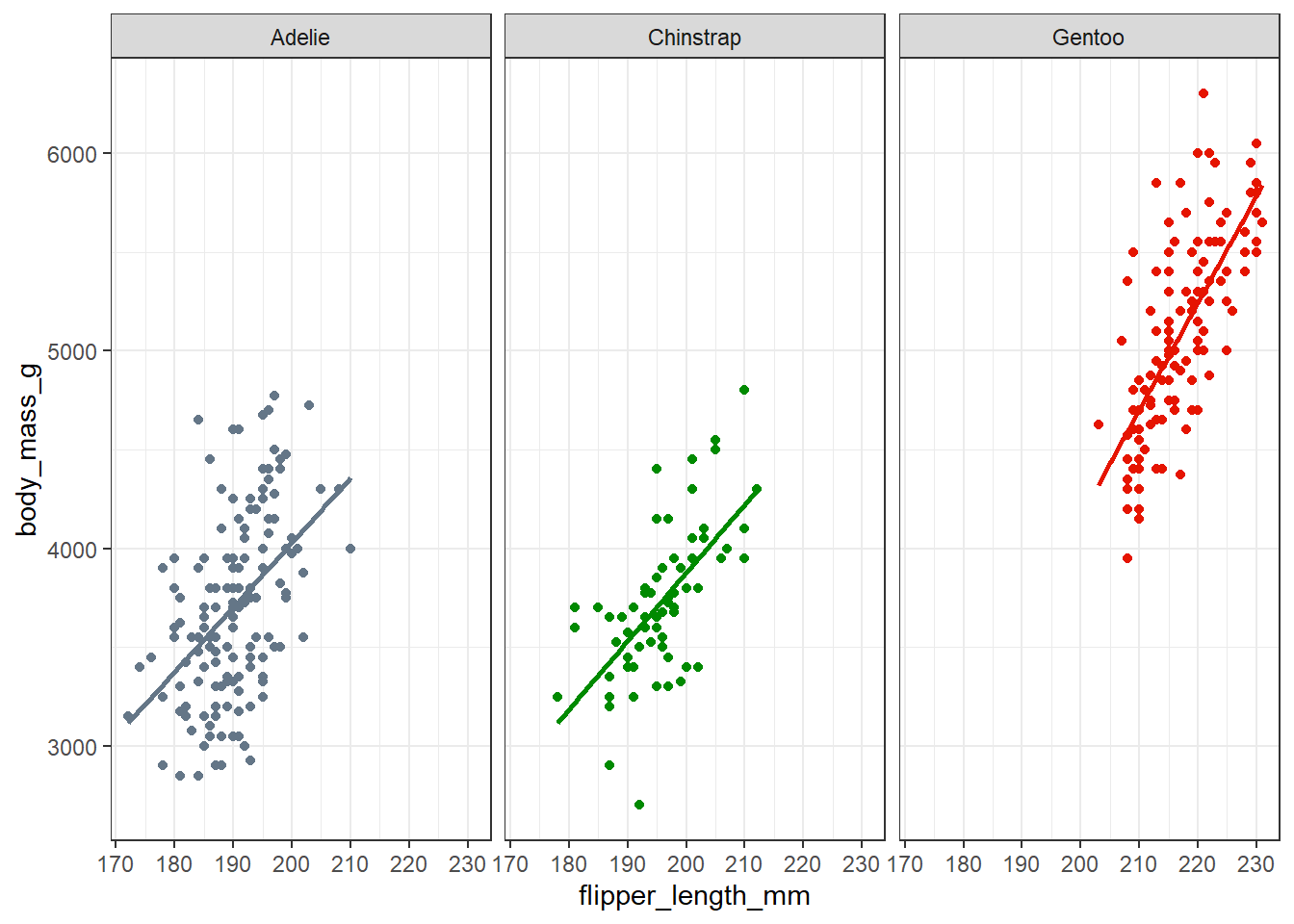
Here, we use the facet_wrap() function to produce what are often referred to as small multiples - a series of closely related graphs. It is very clear that the slopes of the flipper length and body mass association are all similar here, but also that the Gentoo penguins are generally much larger (in terms of each variable) than the other two species.
2.7 A Few Key Points
These comments are highly motivated by Gelman, Hill, and Vehtari (2021), Chapter 2, which is available to you online (pdf).
Never display a graph you can’t talk about.
The goal of any graph is communication to self or others.
Gelman, Hill, and Vehtari (2021) describe three common uses of graphics:
- Exploratory analyses of raw data
- Graphs of fitted models
- Graphs presenting final results
R (and ggplot tools in particular) makes it relatively easy to make attractive plots in all three of these settings.
Finally, it’s almost always useful to think about a graph in terms of what comparison it makes, and to design the graph so that the comparison you want to make is shown accurately and helpfully.
2.8 For More Information
Relevant sections of R for Data Science include:
- Data Visualization
- The Visualization unit, which includes sections on Layers, Exploratory Data Analysis, and Communication that are worth your time.
- Relevant sections of the R Graphics Cookbook include:
- Summarized Data Distributions, which introduces some key code for building histograms and related items like density curves, frequency polygons, box plots, violin plots and dot plots.
- Scatter Plots which introduces several useful code blocks to improve and augment your scatterplots.
- Relevant sections of OpenIntro Stats (pdf) include:
- Section 2 on Summarizing Data
- Section 4.1 on the Normal distribution
For an introductory example covering some key aspects of data, consider reviewing Chapters 1-3 of Introduction to Modern Statistics, 2nd Edition (Çetinkaya-Rundel and Hardin 2024) which discuss an interesting case study on using stents to prevent strokes. We’ll reference this again at the end of our next Chapter.
Another great resource on data and measurement issues is Chapter 2 of Gelman, Hill, and Vehtari (2021), available in PDF at this link. We’ll reference this again at the end of our next Chapter.