3 Numerical Summaries
3.1 R setup for this chapter
This section loads all needed R packages for this chapter. Appendix A lists all R packages used in this book, and also provides R session information. Appendix B describes the 431-Love.R script, and demonstrates its use.
3.2 Data require structure and context
Descriptive statistics are concerned with the presentation, organization and summary of data, as suggested in Norman and Streiner (2014). This includes various methods of organizing and graphing data to get an idea of what those data can tell us.
As Vittinghoff et al. (2012) suggest, the nature of the measurement determines how best to describe it statistically, and the main distinction is between numerical and categorical variables. Even this is a little tricky - plenty of data can have values that look like numerical values, but are just numerals serving as labels.
As Bock, Velleman, and De Veaux (2004) point out, the truly critical notion, of course, is that data values, no matter what kind, are useless without their contexts. The Five W’s (Who, What [and in what units], When, Where, Why, and often How) are just as useful for establishing the context of data as they are in journalism. If you can’t answer Who and What, in particular, you don’t have any useful information.
In general, each row of a data frame corresponds to an individual (respondent, experimental unit, record, or observation) about whom some characteristics are gathered in columns (and these characteristics may be called variables, factors or data elements.) Every column / variable should have a name that indicates what it is measuring, and every row / observation should have a name that indicates who is being measured.
3.3 Data Source: The Palmer Penguins, again
Appendix C provides further guidance on pulling data from other systems into R, while Appendix D gives more information (including download links) for all data sets used in this book.
Again, we’ll use the penguins tibble from the palmerpenguins package, as we did in Chapter 2.
penguins# A tibble: 344 × 8
species island bill_length_mm bill_depth_mm flipper_length_mm body_mass_g
<fct> <fct> <dbl> <dbl> <int> <int>
1 Adelie Torgersen 39.1 18.7 181 3750
2 Adelie Torgersen 39.5 17.4 186 3800
3 Adelie Torgersen 40.3 18 195 3250
4 Adelie Torgersen NA NA NA NA
5 Adelie Torgersen 36.7 19.3 193 3450
6 Adelie Torgersen 39.3 20.6 190 3650
7 Adelie Torgersen 38.9 17.8 181 3625
8 Adelie Torgersen 39.2 19.6 195 4675
9 Adelie Torgersen 34.1 18.1 193 3475
10 Adelie Torgersen 42 20.2 190 4250
# ℹ 334 more rows
# ℹ 2 more variables: sex <fct>, year <int>n_miss(penguins)[1] 19Almost all serious statistical analyses have to deal with missing data. Data values that are missing are indicated in R, and to R, by the symbol NA.
To simplify our work in this chapter, we’ll focus on a version of the penguins data which includes only complete observations, with known values for all 8 variables in the tibble. To create such a version, which filters the observations down to those penguins without any missing data on any variables, we use the drop_na() function, like this:
We will filter to complete cases by dropping missing values for much of this book, postponing the use of imputation-based approaches to dealing with missing data until Section 16.6.
Until that time, we will make the formal assumption that all missing data are missing completely at random, a term we’ll define more carefully in Section 16.6. If that MCAR assumption holds, then a complete case analysis is appropriate.
3.4 Numerical Summaries
Visit Appendix E as you like for additional information about statistical formulas relevant to this chapter and the book more generally.
3.4.1 Quantitative Variables
Variables recorded in numbers that we use as numbers are called quantitative. Familiar examples include incomes, heights, weights, ages, distances, times, and counts. All quantitative variables have measurement units, which tell you how the quantitative variable was measured. Without units (like miles per hour, angstroms, yen or degrees Celsius) the values of a quantitative variable have no meaning.
It does little good to be told the price of something if you don’t know the currency being used.
You might be surprised to see someone whose age is 72 listed in a database on childhood diseases until you find out that age is measured in months.
Often just seeking the units can reveal a variable whose definition is challenging - just how do we measure “friendliness”, or “success,” for example.
Quantitative variables may also be classified by whether they are continuous or can only take on a discrete set of values. Continuous data may take on any value, within a defined range. Suppose we are measuring height. While height is really continuous, our measuring stick usually only lets us measure with a certain degree of precision. If our measurements are only trustworthy to the nearest centimeter with the ruler we have, we might describe them as discrete measures. But we could always get a more precise ruler. The measurement divisions we make in moving from a continuous concept to a discrete measurement are usually fairly arbitrary. Another way to think of this, if you enjoy music, is that, as suggested in Norman and Streiner (2014), a piano is a discrete instrument, but a violin is a continuous one, enabling finer distinctions between notes than the piano is capable of making. Sometimes the distinction between continuous and discrete is important, but usually, it’s not.
3.4.2 summary() for a data frame / tibble
summary(penguins) species island bill_length_mm bill_depth_mm
Adelie :152 Biscoe :168 Min. :32.10 Min. :13.10
Chinstrap: 68 Dream :124 1st Qu.:39.23 1st Qu.:15.60
Gentoo :124 Torgersen: 52 Median :44.45 Median :17.30
Mean :43.92 Mean :17.15
3rd Qu.:48.50 3rd Qu.:18.70
Max. :59.60 Max. :21.50
NA's :2 NA's :2
flipper_length_mm body_mass_g sex year
Min. :172.0 Min. :2700 female:165 Min. :2007
1st Qu.:190.0 1st Qu.:3550 male :168 1st Qu.:2007
Median :197.0 Median :4050 NA's : 11 Median :2008
Mean :200.9 Mean :4202 Mean :2008
3rd Qu.:213.0 3rd Qu.:4750 3rd Qu.:2009
Max. :231.0 Max. :6300 Max. :2009
NA's :2 NA's :2 As we can see, the summary() function, when applied to a tibble or data frame provides counts of each level for factor (categorical) variables like species, sex and island. If values are missing, as in the sex variable, they are indicated with counts of NA’s (NA stands for Not Available.)
For quantities like bill_length_mm, bill_depth_mm, flipper_length_mm, and body_mass_g, we also see counts of missing values gathered as NA’s. In addition, we get a Mean of the sample, and a five-number summary of its distribution.
| Summary Statistic | Description |
|---|---|
| Min or Minimum | Smallest non-missing value in data. |
| 1st Quartile or Q1 | 25th percentile (median of lower half of data.) |
| Median or Q2 | Middle value when data are sorted in order. |
| 3rd Quartile or Q3 | 75th percentile (median of upper half of data.) |
| Max or Maximum | Largest non-missing value in data. |
| Mean | Sum of the values divided by the number of values. |
3.4.3 fivenum() for a five-number summmary
Note that we can use the fivenum() function to obtain these first five values.
As noted in Chapter 2, these are the summaries indicated by an ordinary boxplot.
Another, perhaps simpler, way to obtain this information is:
fivenum(penguins$bill_length_mm)[1] 32.10 39.20 44.45 48.50 59.60We could, for instance, summarize any distribution using uncertainty intervals built from these quantiles. For example, 39.2 to 48.5 is a central 50% interval for these data.
3.4.4 More summaries with lovedist()
We can obtain some additional summaries for any particular variable using a function called lovedist() from the Love-431.R script which is described in Appendix B.
penguins |>
  reframe(lovedist(bill_length_mm))
# A tibble: 1 × 10
n miss mean sd med mad min q25 q75 max
<int> <int> <dbl> <dbl> <dbl> <dbl> <dbl> <dbl> <dbl> <dbl>
1 344 2 43.9 5.46 44.4 7.04 32.1 39.2 48.5 59.6This approach adds four new summaries to the mean and five-number summary available from summary(). Formulas are available in Appendix E.
| Summary Statistic | Description |
|---|---|
| n or count | number of values contained in the variable (including missing) |
| miss | number of missing values |
| sd | standard deviation, a measure of variation |
| mad | median absolute deviation, also a measure of variation |
We often summarize the center and spread (variation) in our data with a two-part summary.
- Should the data approximate a Normal distribution (bell-shaped curve,) the mean and standard deviation are commonly used to describe the variation.
- The median and mad are generally better options when a Normal distribution isn’t a good fit to our data.
We can also use lovedist() to look at stratified summaries within groups defined by a factor. Here, we also show the use of the kable() function (from the knitr package) to tidy up the table and reduce the number of decimal places shown.
| species | n | miss | mean | sd | med | mad | min | q25 | q75 | max |
|---|---|---|---|---|---|---|---|---|---|---|
| Adelie | 152 | 1 | 38.79 | 2.66 | 38.80 | 2.97 | 32.1 | 36.75 | 40.75 | 46.0 |
| Gentoo | 124 | 1 | 47.50 | 3.08 | 47.30 | 3.11 | 40.9 | 45.30 | 49.55 | 59.6 |
| Chinstrap | 68 | 0 | 48.83 | 3.34 | 49.55 | 3.63 | 40.9 | 46.35 | 51.08 | 58.0 |
3.4.5 Mean and SD, Median and MAD
As mentioned, one natural option (especially appropriate when the data follow a Normal distribution) is to use the sample mean and standard deviation.
mean_sd(penguins$bill_length_mm) -SD Mean +SD
38.46235 43.92193 49.38151 The mean_sd function shows us the sample mean \(\pm\) the standard deviation. Should the data follow a Normal distribution,
- the sample mean \(\pm\) 1 standard deviation forms an interval which covers approximately 68% of the data.
- The sample mean \(\pm\) 2 standard deviations will cover 95% of data which follow a Normal distribution.
- The sample mean \(\pm\) 3 standard deviations covers approximately 99.7% of the data for a Normal distribution.
The standard deviation is also defined as the square root of the variance, which is another important measure of variation.
var(penguins$bill_length_mm, na.rm = TRUE)[1] 29.80705sd(penguins$bill_length_mm, na.rm = TRUE)[1] 5.459584sd(penguins$bill_length_mm, na.rm = TRUE)^2[1] 29.80705As Gelman, Hill, and Vehtari (2021) point out, the variance is interpretable as the mean of the squared difference from the mean.
The standard deviation is more often used to measure variation than the variance because the standard deviation has the same units of measurement as the mean.
When we don’t have much data, or when we’re unwilling to conclude that the data match up well with a Normal distribution, a more robust pair of estimates is the median and the MAD.
median_mad(penguins$bill_length_mm) -MAD Median +MAD
37.40765 44.45000 51.49235 As noted in Appendix E, the mad is scaled by R to take the same value as the standard deviation if the data are really Normally distributed, much as a Normal distribution’s mean is equal to its median.
We can often interpret a median/mad combination in an analogous way to our interpretation of the mean and standard deviation, as a set of building blocks for intervals which describe the center and spread of our data, even when the data show skew or other non-Normality. As Gelman, Hill, and Vehtari (2021) point out,
… median-based summaries are also frequently more computationally stable (than means and standard deviations,) and more robust against outlying values.
3.4.6 Coefficient of Variation
The coefficient of variation is the sample standard deviation divided by the mean. It quantifies the variation in the data related to the mean, and is useful only when describing quantities that have a meaningful zero value.
penguins_cc |> summarise(mean = mean(flipper_length_mm),
                         var = var(flipper_length_mm),
                         sd = sd(flipper_length_mm),
                         cv = sd / mean)
# A tibble: 1 × 4
mean var sd cv
<dbl> <dbl> <dbl> <dbl>
1 201. 196. 14.0 0.0697We can use the coef_var() function from the datawizard package in the easystats family to compute this value.
coef_var(penguins$flipper_length_mm)[1] NASince we have some missing data, this summary needs to be told to remove it.
coef_var(penguins$flipper_length_mm, remove_na = TRUE)[1] 0.0699883coef_var(penguins_cc$flipper_length_mm)[1] 0.06974164Notice that penguins_cc contains only the 333 observations with complete data on all 8 variables included in the penguins data, while removing the NA in the second function below only removes the 2 penguins with missing values of flipper_length_mm from the original set of 344 penguins.
3.4.7 Standard Error of the Sample Mean
The standard error of the sample mean is the final summary we’ll discuss here for a quantitative variable like bill_depth_mm. It is the sample standard deviation divided by the square root of the sample size.
penguins_cc |> summarise(n = n(),
                         mean = mean(bill_depth_mm),
                         sd = sd(bill_depth_mm),
                         se_mean = sd / sqrt(n))
# A tibble: 1 × 4
n mean sd se_mean
<int> <dbl> <dbl> <dbl>
1 333 17.2 1.97 0.108Generally, a standard error is the estimated standard deviation of an estimate, and is a good way of telling us about uncertainty in our estimate.
3.4.8 describe_distribution()
Another approach, from the datawizard package within the easystats family, is describe_distribution(), which provides some additional summaries for quantities within our data frame.
describe_distribution(penguins) |> kable(digits = 2)| Variable | Mean | SD | IQR | Min | Max | Skewness | Kurtosis | n | n_Missing |
|---|---|---|---|---|---|---|---|---|---|
| bill_length_mm | 43.92 | 5.46 | 9.30 | 32.1 | 59.6 | 0.05 | -0.88 | 342 | 2 |
| bill_depth_mm | 17.15 | 1.97 | 3.12 | 13.1 | 21.5 | -0.14 | -0.91 | 342 | 2 |
| flipper_length_mm | 200.92 | 14.06 | 23.25 | 172.0 | 231.0 | 0.35 | -0.98 | 342 | 2 |
| body_mass_g | 4201.75 | 801.95 | 1206.25 | 2700.0 | 6300.0 | 0.47 | -0.72 | 342 | 2 |
| year | 2008.03 | 0.82 | 2.00 | 2007.0 | 2009.0 | -0.05 | -1.50 | 344 | 0 |
This approach adds four new summaries to those we’ve seen before, specifically:
| Summary Statistic | Description |
|---|---|
| IQR | inter-quartile range = 75th - 25th percentile |
| Range | combination of minimum and maximum, or the difference between the maximum and minimum values |
| Skewness | a measure of the asymmetry in the distribution of our data (positive values indicate right skew, negative values indicate left skew) |
| Kurtosis | a measure of tail behavior in the distribution of our data (positive values indicate fatter tails than a Normal distribution, while negative values indicate thinner tails) |
See Appendix E for more on the measures for skew and kurtosis used by describe_distribution(). In practice, I very rarely look at those two summaries, preferring to use visualizations to build my understanding of the shape of a distribution.
3.4.9 Augmenting a describe_distribution()
set.seed(431)
penguins |>
  select(bill_depth_mm, body_mass_g) |>
  describe_distribution(ci = 0.95, iterations = 500,
                        quartiles = FALSE) |>
  kable(digits = 2)
Bootstrapping confidence intervals using 500 iterations, please be
patient...| Variable | Mean | SD | IQR | CI_low_mean | CI_high_mean | Min | Max | Skewness | Kurtosis | n | n_Missing |
|---|---|---|---|---|---|---|---|---|---|---|---|
| bill_depth_mm | 17.15 | 1.97 | 3.12 | 16.95 | 17.35 | 13.1 | 21.5 | -0.14 | -0.91 | 342 | 2 |
| body_mass_g | 4201.75 | 801.95 | 1206.25 | 4119.36 | 4283.31 | 2700.0 | 6300.0 | 0.47 | -0.72 | 342 | 2 |
- In estimating the mean of bill depth, our sample yields a point estimate of 17.15 mm and a 95% bootstrap confidence interval which extends from 16.95 to 17.35 mm.
Here, we augment the describe_description() results by adding a bootstrap confidence interval for the mean of the quantities of interest, and make room for that in the table by dropping the information about the individual quartiles. The bootstrap approach (which we’ll discuss later in some detail) requires us to set a random seed to help with replication, and to specify which level of confidence we want to use (here, I used 95%.)
Another approach we can take is to find a bootstrap confidence interval for the median of the data, as follows. Note that the median and MAD become the focus of this table, rather than the mean and standard deviation.
penguins |>
  select(bill_depth_mm, body_mass_g) |>
  describe_distribution(centrality = "median",
                        ci = 0.95, iterations = 500,
                        quartiles = FALSE) |>
  kable(digits = 2)
Bootstrapping confidence intervals using 500 iterations, please be
patient...| Variable | Median | MAD | IQR | CI_low_median | CI_high_median | Min | Max | Skewness | Kurtosis | n | n_Missing |
|---|---|---|---|---|---|---|---|---|---|---|---|
| bill_depth_mm | 17.3 | 2.22 | 3.12 | 17.02 | 17.80 | 13.1 | 21.5 | -0.14 | -0.91 | 342 | 2 |
| body_mass_g | 4050.0 | 889.56 | 1206.25 | 3900.00 | 4188.12 | 2700.0 | 6300.0 | 0.47 | -0.72 | 342 | 2 |
- In estimating the median of bill depth, our sample yields a point estimate of 17.3 mm and a 95% bootstrap confidence interval which extends from 17.02 to 17.80 mm.
Other options for using describe_distribution() can be found on its web page.
3.4.10 Finding the most common value (mode)
flipper_length_mm
172 174 176 178 179 180 181 182 183 184 185 186 187 188 189 190 191 192 193 194
  1   1   1   4   1   5   7   3   2   7   9   7  16   6   7  22  13   7  15   5
195 196 197 198 199 200 201 202 203 205 206 207 208 209 210 211 212 213 214 215
 17  10  10   8   6   4   6   4   5   3   1   2   8   5  14   2   7   6   6  12
216 217 218 219 220 221 222 223 224 225 226 228 229 230 231
  8   6   5   5   8   5   6   2   3   4   1   4   2   7   1
It appears that 190, which happens 22 times in our data, is the most common value. We can obtain this directly using distribution_mode() from the datawizard package in easystats.
distribution_mode(penguins$flipper_length_mm)[1] 190Another related estimate to the mode is the highest maximum a posteriori (or MAP) estimate (which indicates the “peak” of a posterior distribution in a Bayesian analysis, as we’ll see.)
To obtain a MAP estimate of the mode, we can use the map_estimate() function from the datawizard package in easystats.
map_estimate(penguins$flipper_length_mm)MAP Estimate
Parameter | MAP_Estimate
------------------------
x | 191.153.5 What makes an outlier?
An outlier is a value far away from the center of a distribution, that is deserving of additional attention, in part to ensure that the value is valid and was reliably measured and captured, but also because such outliers can substantially influence our models and summaries.
One approach, used, for instance, in the development of boxplots, comes from Tukey (1977), and uses the data’s 25th and 75th percentiles, plus the difference between the two: the inter-quartile range:
- Mark as outliers any values which are outside the range of Q25 - 1.5 (IQR) to Q75 + 1.5 (IQR)
- Mark as serious outliers (or “far out”) any values outside the range of Q25 - 3 IQR to Q75 + 3 IQR.
For example, consider this boxplot of bill length for penguins coming from the Biscoe island.
penguins |>
  filter(complete.cases(island, bill_length_mm)) |>
  filter(island == "Biscoe") |>
  ggplot( aes(x = bill_length_mm, y = "Biscoe") ) +
  geom_boxplot() +
  theme_bw() + labs(y = "", title = "Boxplot for Biscoe island")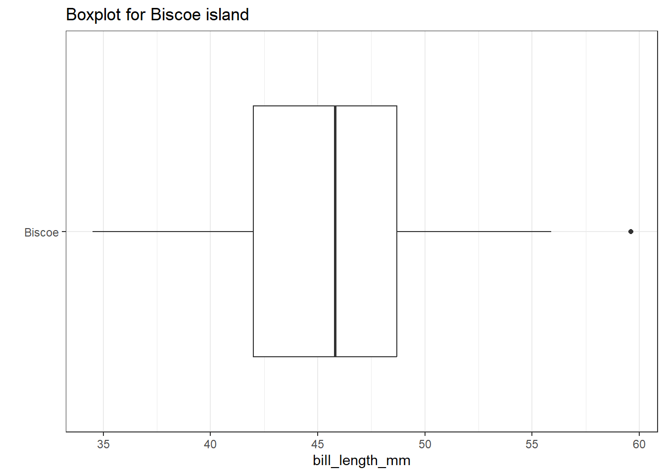
Note that one value (near 60) is identified by a dot outside of the plot’s whiskers. This suggests the point is an outlier (by Tukey’s standards.)
Here’s the five-number summary for these penguins:
dat1 <- penguins |>
  filter(complete.cases(island, bill_length_mm)) |>
  filter(island == "Biscoe")

fivenum(dat1$bill_length_mm)
[1] 34.5 42.0 45.8 48.7 59.6IQR(dat1$bill_length_mm)[1] 6.7We see that the minimum value in this cut of our data is 34.5 and the maximum is 59.6.
Our Q25 is 42 and our Q75 is 48.7, so the IQR = 6.7. So, the bounds for outliers extend to all points which are either:
- below Q25 - 1.5 IQR = 42 - 1.5(6.7) = 31.95, or
- above Q75 + 1.5 IQR = 48.7 + 1.5(6.7) = 58.05
And the bounds for serious outliers extend to points:
- below Q25 - 3.0 IQR = 42 - 3(6.7) = 21.9, or
- above Q75 + 3.0 IQR = 48.7 + 3(6.7) = 68.8
Our maximum value is identified by the boxplot as an outlier because it meets the standard Tukey established for being an outlier.
- The values of (Q25 - 1.5 IQR) and (Q75 + 1.5 IQR) are sometimes referred to as the inner fences of the data.
- (Q25 - 3 IQR) and (Q75 + 3 IQR) are then referred to as the outer fences.
3.6 Describing Categories
3.6.1 Qualitative (Categorical) Variables
Qualitative or categorical variables consist of names of categories. These names may be numerical, but the numbers (or names) are simply codes to identify the groups or categories into which the individuals are divided. Categorical variables with two categories, like yes or no, up or down, or, more generally, 1 and 0, are called binary variables. Those with more than two-categories are sometimes called multi-categorical variables.
3.6.2 Nominal vs. Ordinal Categories
- When the categories included in a variable are merely names, and come in no particular order, we sometimes call them nominal variables. The most important summary of such a variable is usually a table of frequencies, and the mode becomes an important single summary, while the mean and median are essentially useless.
In the penguins data, species is a nominal variable with multiple unordered categories. So is island.
The alternative categorical variable (where order matters) is called ordinal, and includes variables that are sometimes thought of as falling right in between quantitative and qualitative variables. An example in the
penguinsdata is theyearvariable.Answers to questions like “How is your overall physical health?” with available responses Excellent, Very Good, Good, Fair or Poor, which are often coded as 1-5, certainly provide a perceived order, but a group of people with average health status 4 (Very Good) is not necessarily twice as healthy as a group with average health status of 2 (Fair).
Sometimes we treat the values from ordinal variables as sufficiently scaled to permit us to use quantitative approaches like means, quantiles, and standard deviations to summarize and model the results, and at other times, we’ll treat ordinal variables as if they were nominal, with tables and percentages our primary tools.
Note that all binary variables (like
sexin the penguins data) may be treated as either ordinal, or nominal.
Lots of variables may be treated as either quantitative or qualitative, depending on how we use them. For instance, we usually think of age as a quantitative variable, but if we simply use age to make the distinction between “child” and “adult” then we are using it to describe categorical information. Just because your variable’s values are numbers, don’t assume that the information provided is quantitative.
3.6.3 Counting Categories
One of the most important things we can do with any categorical variable, like species, sex or island in our penguins data, is to count it.
penguins |> count(species)# A tibble: 3 × 2
species n
<fct> <int>
1 Adelie 152
2 Chinstrap 68
3 Gentoo 124We see we have more Adelie penguins than Gentoo, and fewer Chinstrap than either of the other species. Of our total of 152 + 68 + 124 = 344 penguins in this sample, 152 (44.2%) are Adelie penguins, for example. We also see that each penguin fits into one of these three species.
3.6.4 Species and Island
Do the counts vary meaningfully by island on which they were spotted?
penguins |> count(species, island)# A tibble: 5 × 3
species island n
<fct> <fct> <int>
1 Adelie Biscoe 44
2 Adelie Dream 56
3 Adelie Torgersen 52
4 Chinstrap Dream 68
5 Gentoo Biscoe 124Yes. Only Adelie penguins are found on all three islands. The Dream island has only Adelie and Chinstrap penguins, while the Biscoe island has only Adelie and Gentoo, with the Torgeson island home to only the Adelie.
3.6.5 Creating a small table
Can we build a table to show the association of, say, species and sex?
table(penguins$species, penguins$sex, useNA = "ifany")
            female male <NA>
  Adelie        73   73    6
  Chinstrap     34   34    0
  Gentoo        58   61    5
Since there are some missing values in sex, the table() function requires us to indicate what we want to do about those missing values.
3.6.6 Using tabyl()
A related function that I use frequently for building contingency tables like this is called tabyl() which comes from the janitor package.
penguins |> tabyl(species, island) species Biscoe Dream Torgersen
Adelie 44 56 52
Chinstrap 0 68 0
Gentoo 124 0 0The tabyl() package generates tabyls in a way that lets us pull them directly into a tibble, which will be useful down the road. We also can add in a large array of “adorning” features to the result.
Here, we add row and column totals and a title to our tabyl.
penguins |>
  tabyl(species, island) |>
  adorn_totals(where = c("row", "col")) |>
  adorn_title() |>
kable()| island | ||||
|---|---|---|---|---|
| species | Biscoe | Dream | Torgersen | Total |
| Adelie | 44 | 56 | 52 | 152 |
| Chinstrap | 0 | 68 | 0 | 68 |
| Gentoo | 124 | 0 | 0 | 124 |
| Total | 168 | 124 | 52 | 344 |
Next, we create a tabyl which includes both counts and row-wise percentages.
penguins |>
  tabyl(species, island) |>
  adorn_percentages(denominator = "row") |>
  adorn_pct_formatting() |>
  adorn_ns(position = "front")
species Biscoe Dream Torgersen
Adelie 44 (28.9%) 56 (36.8%) 52 (34.2%)
Chinstrap 0 (0.0%) 68 (100.0%) 0 (0.0%)
Gentoo 124 (100.0%) 0 (0.0%) 0 (0.0%)More on tabyl() can be found in this article and the janitor webpage.
3.6.7 Using data_tabulate()
The datawizard package provides a function called data_tabulate() which produces similar kinds of tables.
data_tabulate(penguins$species, penguins$island)penguins$species | Biscoe | Dream | Torgersen | <NA> | Total
-----------------+--------+-------+-----------+------+------
Adelie | 44 | 56 | 52 | 0 | 152
Chinstrap | 0 | 68 | 0 | 0 | 68
Gentoo | 124 | 0 | 0 | 0 | 124
<NA> | 0 | 0 | 0 | 0 | 0
-----------------+--------+-------+-----------+------+------
Total | 168 | 124 | 52 | 0 | 344Here, we add some column percentages, and drop the column of NA results.
data_tabulate(penguins$species, penguins$island,
              remove_na = TRUE, proportions = "col"
)
penguins$species | Biscoe | Dream | Torgersen | Total
-----------------+-------------+------------+-------------+------
Adelie | 44 (26.2%) | 56 (45.2%) | 52 (100.0%) | 152
Chinstrap | 0 (0.0%) | 68 (54.8%) | 0 (0.0%) | 68
Gentoo | 124 (73.8%) | 0 (0.0%) | 0 (0.0%) | 124
-----------------+-------------+------------+-------------+------
Total | 168 | 124 | 52 | 344More on data_tabulate() can be found on its web page.
3.6.8 Plotting Counts
The ggplot approach to plotting cross-tabular data usually makes use of the geom_count() or geom_jitter() functions, as follows:
ggplot(penguins, aes(x = species, y = island)) +
  geom_count() +
  theme_bw()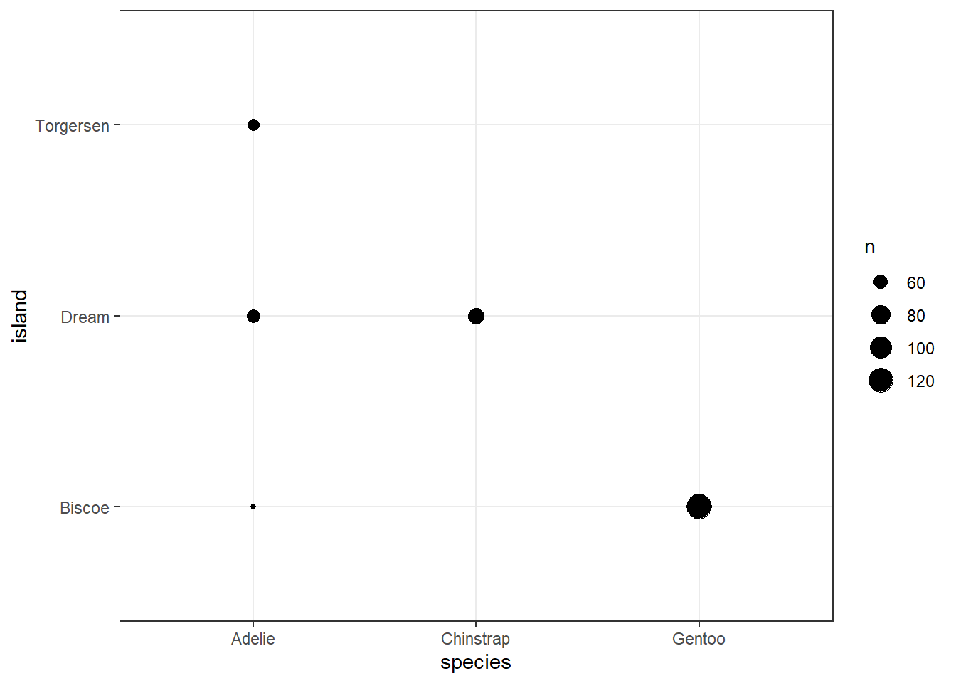
ggplot(penguins, aes(x = species, y = island)) +
  geom_jitter() +
  theme_bw()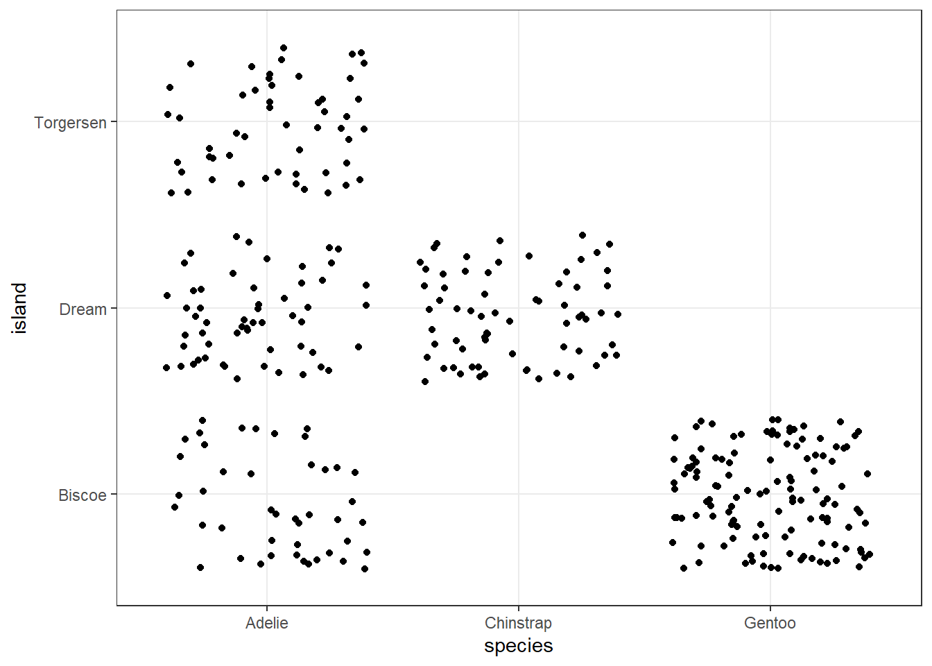
3.7 For More Information
- For an introductory example covering some key aspects of data, consider reviewing Chapters 1-3 of Introduction to Modern Statistics, 2nd Edition (Çetinkaya-Rundel and Hardin 2024) which discuss an interesting case study on using stents to prevent strokes.
- Another great resource on data and measurement issues is Chapter 2 of Gelman, Hill, and Vehtari (2021), available in PDF at this link.
- Relevant sections of OpenIntro Stats (pdf) include:
- Section 2 on Summarizing Data
- Section 4.3 on the Binomial distribution
- Visit Appendix E as you like for additional information about statistical formulas relevant to this chapter and the book more generally.
- Wikipedia on Descriptive Statistics and on Summary Statistics and on Outliers.