Chapter 17 A Paired Sample Study: Lead in the Blood of Children
One of the best ways to eliminate a source of variation and the errors of interpretation associated with it is through the use of matched pairs. Each subject in one group is matched as closely as possible by a subject in the other group. If a 45-year-old African-American male with hypertension is given a [treatment designed to lower their blood pressure], then we give a second, similarly built 45-year old African-American male with hypertension a placebo.
- Good (2005), section 5.2.4
17.1 The Lead in the Blood of Children Study
Morton et al. (1982) studied the absorption of lead into the blood of children. This was a matched-sample study, where the exposed group of interest contained 33 children of parents who worked in a battery manufacturing factory (where lead was used) in the state of Oklahoma. Specifically, each child with a lead-exposed parent was matched to another child of the same age, exposure to traffic, and living in the same neighborhood whose parents did not work in lead-related industries. So the complete study had 66 children, arranged in 33 matched pairs. The outcome of interest, gathered from a sample of whole blood from each of the children, was lead content, measured in mg/dl.
One motivation for doing this study is captured in the Abstract from Morton et al. (1982).
It has been repeatedly reported that children of employees in a lead-related industry are at increased risk of lead absorption because of the high levels of lead found in the household dust of these workers.
The data are available in several places, including Table 5 of Pruzek and Helmreich (2009), in the BloodLead data set within the PairedData package in R, but we also make them available in the bloodlead.csv file. A table of the first three pairs of observations (blood lead levels for one child exposed to lead and the matched control) is shown below.
# A tibble: 3 x 3
  pair  exposed control
  <chr>   <int>   <int>
1 P01        38      16
2 P02        23      18
3 P03 41 18- In each pair, one child was exposed (to having a parent working in the factory) and the other was not.
- Otherwise, though, each child was very similar to its matched partner.
- The data under
exposedandcontrolare the blood lead content, in mg/dl.
Our primary goal will be to estimate the difference in lead content between the exposed and control children, and then use that sample estimate to make inferences about the difference in lead content between the population of all children like those in the exposed group and the population of all children like those in the control group.
17.1.1 Our Key Questions for a Paired Samples Comparison
- What is the population under study?
- All pairs of children living in Oklahoma near the factory in question, in which one had a parent working in a factory that exposed them to lead, and the other did not.
- What is the sample? Is it representative of the population?
- The sample consists of 33 pairs of one exposed and one control child.
- This is a case-control study, where the children were carefully enrolled to meet the design criteria. Absent any other information, we’re likely to assume that there is no serious bias associated with these pairs, and that assuming they represent the population effectively (and perhaps the broader population of kids whose parents work in lead-based industries more generally) may well be at least as reasonable as assuming they don’t.
- Who are the subjects / individuals within the sample?
- Each of our 33 pairs of children includes one exposed child and one unexposed (control) child.
- What data are available on each individual?
- The blood lead content, as measured in mg/dl of whole blood.
17.1.2 Lead Study Caveats
Note that the children were not randomly selected from general populations of kids whose parents did and did not work in lead-based industries.
- To make inferences to those populations, we must make strong assumptions to believe, for instance, that the sample of exposed children is as representative as a random sample of children with similar exposures across the world would be.
- The researchers did have a detailed theory about how the exposed children might be at increased risk of lead absorption, and in fact as part of the study gathered additional information about whether a possible explanation might be related to the quality of hygiene of the parents (all of them were fathers, actually) who worked in the factory.
- This is an observational study, so that the estimation of a causal effect between parental work in a lead-based industry and children’s blood lead content can be made, without substantial (and perhaps heroic) assumptions.
17.2 Exploratory Data Analysis for Paired Samples
We’ll begin by adjusting the data in two ways.
- We’d like that first variable (
pair) to be afactorrather than acharactertype in R, because we want to be able to summarize it more effectively. So we’ll make that change. - Also, we’d like to calculate the difference in lead content between the exposed and the control children in each pair, and we’ll save that within-pair difference in a variable called
leaddiff. We’ll takeleaddiff=exposed-controlso that positive values indicate increased lead in the exposed child.
# A tibble: 33 x 4
   pair  exposed control leaddiff
   <fct>   <int>   <int>    <int>
 1 P01        38      16       22
 2 P02        23      18        5
 3 P03        41      18       23
 4 P04        18      24       -6
 5 P05        37      19       18
 6 P06        36      11       25
 7 P07        23      10       13
 8 P08        62      15       47
 9 P09        31      16       15
10 P10        34      18       16
# ... with 23 more rows
17.2.1 The Paired Differences
To begin, we focus on leaddiff for our exploratory work, which is the exposed - control difference in lead content within each of the 33 pairs. So, we’ll have 33 observations, as compared to the 462 in the serum zinc data, but most of the same tools are still helpful.
p1 <- ggplot(bloodlead, aes(x = leaddiff)) +
    geom_histogram(aes(y = ..density..), bins = fd_bins(bloodlead$leaddiff),
                   fill = "lightsteelblue4", col = "white") +
    stat_function(fun = dnorm,
                  args = list(mean = mean(bloodlead$leaddiff),
                              sd = sd(bloodlead$leaddiff)),
                  lwd = 1.5, col = "navy") +
    labs(title = "Histogram",
         x = "Diff. in Lead Content (mg/dl)", y = "Density") +
    theme_bw()

p2 <- ggplot(bloodlead, aes(x = 1, y = leaddiff)) +
    geom_boxplot(fill = "lightsteelblue4", notch = TRUE) +
    theme(axis.text.x = element_blank(), axis.ticks.x = element_blank()) +
    labs(title = "Boxplot",
         y = "Difference in Blood Lead Content (mg/dl)", x = "") +
    theme_bw()

p3 <- ggplot(bloodlead, aes(sample = leaddiff)) +
    geom_qq(col = "lightsteelblue4", size = 2) +
    geom_abline(intercept = qq_int(bloodlead$leaddiff),
                slope = qq_slope(bloodlead$leaddiff)) +
    labs(title = "Normal Q-Q",
         y = "Difference in Blood Lead Content (mg/dl)", x = "") +
    theme_bw()

gridExtra::grid.arrange(p1, p2, p3, nrow=1,
    top = "Difference in Blood Lead Content (mg/dl) for 33 Pairs of Children")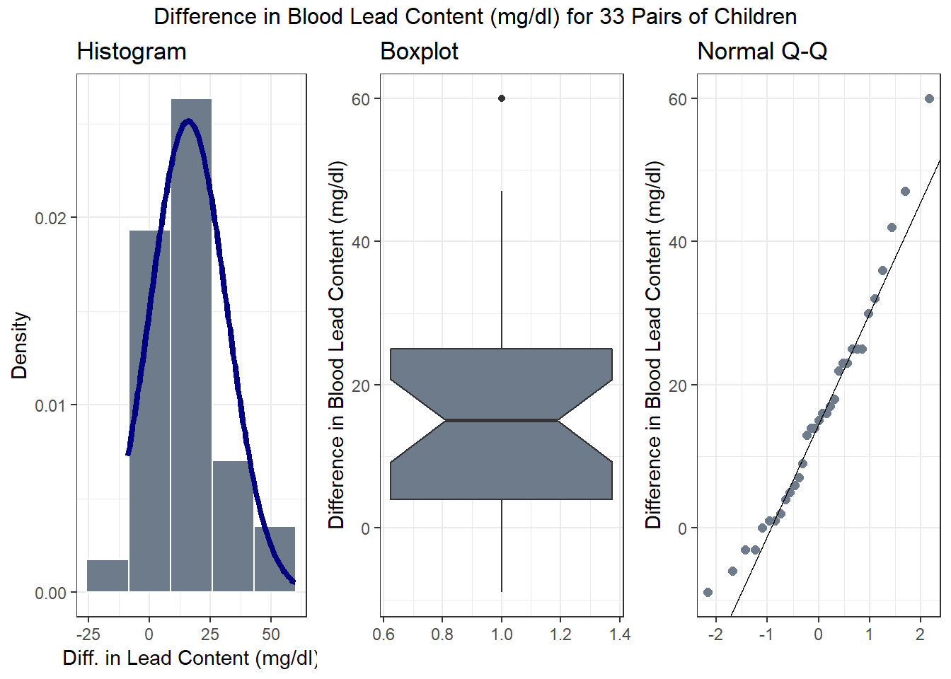
Note that in all of this work, I plotted the paired differences. One obvious way to tell if you have paired samples is that you can pair every single subjects from one exposure group to the subjects in the other exposure group. Everyone has to be paired, so the sample sizes will always be the same in the two groups.
17.2.2 Numerical Summaries
| min | Q1 | median | Q3 | max | mean | sd | n | missing |
|---|---|---|---|---|---|---|---|---|
| -9 | 4 | 15 | 25 | 60 | 15.97 | 15.86 | 33 | 0 |
[1] 0.061117.2.3 Impact of Matching - Scatterplot and Correlation
Here, the data are paired by the study through matching on neighborhood, age and exposure to traffic. Each individual child’s outcome value is part of a pair with the outcome value for his/her matching partner. We can see this pairing in several ways, perhaps by drawing a scatterplot of the pairs.
ggplot(bloodlead, aes(x = control, y = exposed)) +
    geom_point(size = 2) +
    geom_smooth(method = "lm", se = FALSE) +
    annotate("text", 20, 65, col = "blue",
             label = paste("Pearson r = ",
                           round(cor(bloodlead$control, bloodlead$exposed),2))) +
    labs(title = "Paired Samples in Blood Lead study",
         x = "Blood Lead Content in Control Child",
         y = "Blood Lead Content in Exposed Child")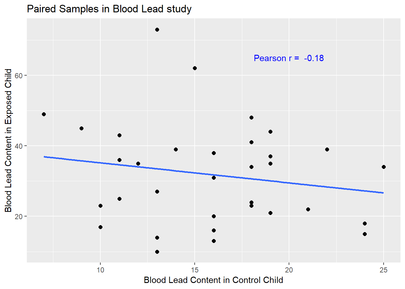
If there is a strong linear relationship (usually with a positive slope, thus positive correlation) between the paired outcomes, then the pairing will be more helpful in terms of improving statistical power of the estimates we build than if there is a weak relationship.
- The stronger the Pearson correlation coefficient, the more helpful pairing will be.
- Here, a straight line model using the control child’s blood lead content accounts for about 3% of the variation in blood lead content in the exposed child.
- As it turns out, pairing will have only a modest impact here on the inferences we draw in the study.
17.3 Looking at the Individual Samples: Tidying the Data with gather
For the purpose of estimating the difference between the exposed and control children, the summaries of the paired differences are what we’ll need.
In some settings, however, we might also look at a boxplot, or violin plot, or ridgeline plot that showed the distributions of exposed and control children separately. But we will run into trouble because one variable (blood lead content) is spread across multiple columns (control and exposed.) The solution is to gather up that variable so as to build a new, tidy tibble.
Because the data aren’t tidied here, so that we have one row for each subject and one column for each variable, we have to do some work to get them in that form for our usual plotting strategy to work well. For more on this approach (gathering and its opposite, spreading the data), visit the Tidy data chapter in Grolemund and Wickham (2017).
blead_tidied <- bloodlead %>%
    gather(control, exposed, key = "status", value = "leadcontent") %>%
    mutate(status = factor(status)) %>%
    select(-leaddiff)

blead_tidied
# A tibble: 66 x 3
pair status leadcontent
<fct> <fct> <int>
1 P01 control 16
2 P02 control 18
3 P03 control 18
4 P04 control 24
5 P05 control 19
6 P06 control 11
7 P07 control 10
8 P08 control 15
9 P09 control 16
10 P10 control 18
# ... with 56 more rowsAnd now, we can plot as usual to compare the two samples.
First, we’ll look at a boxplot, showing all of the data.
ggplot(blead_tidied, aes(x = status, y = leadcontent, fill = status)) +
    geom_boxplot() +
    geom_jitter(width = 0.1, height = 0, color = "orangered") +
    guides(fill = FALSE) +
    labs(title = "Boxplot of Lead Content in Exposed and Control kids") +
    theme_bw()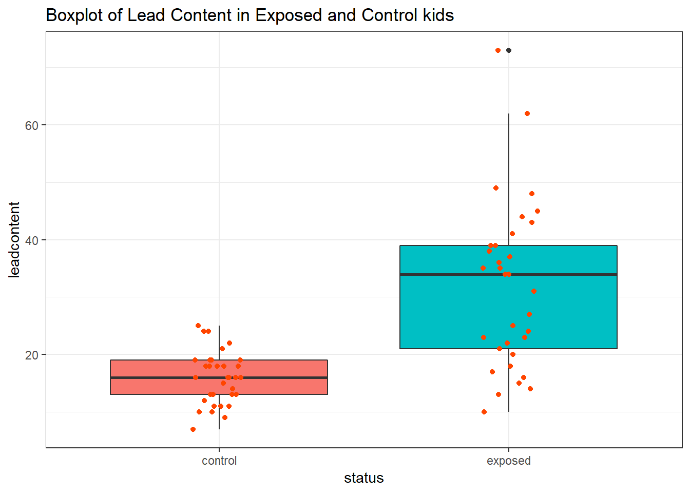
We’ll also look at a ridgeline plot, because Dr. Love likes them, even though they’re really more useful when we’re comparing more than two samples.
ggplot(blead_tidied, aes(x = leadcontent, y = status, fill = status)) +
    ggridges::geom_density_ridges(scale = 0.9) +
    guides(fill = FALSE) +
    labs(title = "Lead Content in Exposed and Control kids") +
    ggridges::theme_ridges()
Picking joint bandwidth of 4.01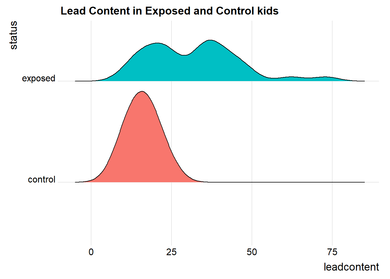
Both the center and the spread of the distribution are substantially larger in the exposed group than in the matched controls. Of course, numerical summaries show these patterns, too.
blead_tidied %>% group_by(status) %>%
    summarise(n = n(),
              median = median(leadcontent),
              Q1 = quantile(leadcontent, 0.25),
              Q3 = quantile(leadcontent, 0.75),
              mean = mean(leadcontent),
              sd = sd(leadcontent))
# A tibble: 2 x 7
status n median Q1 Q3 mean sd
<fct> <int> <int> <dbl> <dbl> <dbl> <dbl>
1 control 33 16 13 19 15.9 4.54
2 exposed 33 34 21 39 31.8 14.4 References
Good, Phillip I. 2005. Introduction to Statistics Through Resampling Methods and R/S-Plus. Hoboken, NJ: Wiley.
Morton, D., A. Saah, S. Silberg, W. Owens, M. Roberts, and M. Saah. 1982. “Lead Absorption in Children of Employees in a Lead Related Industry.” American Journal of Epidemiology 115: 549–55.
Pruzek, Robert M., and James E. Helmreich. 2009. “Enhancing Dependent Sample Analyses with Graphics.” Journal of Statistics Education 17(1). http://ww2.amstat.org/publications/jse/v17n1/helmreich.html.
Grolemund, Garrett, and Hadley Wickham. 2017. R for Data Science. O’Reilly. http://r4ds.had.co.nz/.