Chapter 39 Dehydration Recovery in Kids: A Small Study
The hydrate data describe the degree of recovery that takes place 90 minutes following treatment of moderate to severe dehydration, for 36 children diagnosed at a hospital’s main pediatric clinic.
Upon diagnosis and study entry, patients were treated with an electrolytic solution at one of seven dose levels (0, 0.5, 1.0, 1.5, 2.0, 2.5, 3.0 mEq/l) in a frozen, flavored, ice popsicle. The degree of rehydration was determined using a subjective scale based on physical examination and parental input, converted to a 0 to 100 point scale, representing the percent of recovery (recov.score). Each child’s age (in years) and weight (in pounds) are also available.
First, we’ll check ranges (and for missing data) in the hydrate file.
# A tibble: 36 x 5
      id recov.score  dose   age weight
   <int>       <int> <dbl> <int>  <int>
 1     1          77   0       4     28
 2     2          65   1.5     5     35
 3     3          75   2.5     8     55
 4     4          63   1       9     76
 5     5          75   0.5     5     31
 6     6          82   2       5     27
 7     7          70   1       6     35
 8     8          90   2.5     6     47
 9     9          49   0       9     59
10    10          72   3       8     50
# ... with 26 more rows id recov.score dose age
Min. : 1.0 Min. : 44.0 Min. :0.00 Min. : 3.00
1st Qu.: 9.8 1st Qu.: 61.5 1st Qu.:1.00 1st Qu.: 5.00
Median :18.5 Median : 71.5 Median :1.50 Median : 6.50
Mean :18.5 Mean : 71.6 Mean :1.57 Mean : 6.67
3rd Qu.:27.2 3rd Qu.: 80.0 3rd Qu.:2.50 3rd Qu.: 8.00
Max. :36.0 Max. :100.0 Max. :3.00 Max. :11.00
weight
Min. :22.0
1st Qu.:34.5
Median :47.5
Mean :46.9
3rd Qu.:57.2
Max. :76.0 There are no missing values, and all of the ranges make sense. There are no especially egregious problems to report.
39.1 A Scatterplot Matrix
Next, we’ll use a scatterplot matrix to summarize relationships between the outcome recov.score and the key predictor dose as well as the ancillary predictors age and weight, which are of less interest, but are expected to be related to our outcome. The one below uses the ggpairs function in the GGally package, as introduced in Part A of the Notes. We place the outcome in the bottom row, and the key predictor immediately above it, with age and weight in the top rows, using the select function within the `ggpairs call.
GGally::ggpairs(dplyr::select(hydrate, age, weight, dose, recov.score),
                title = "Scatterplot Matrix for hydrate data")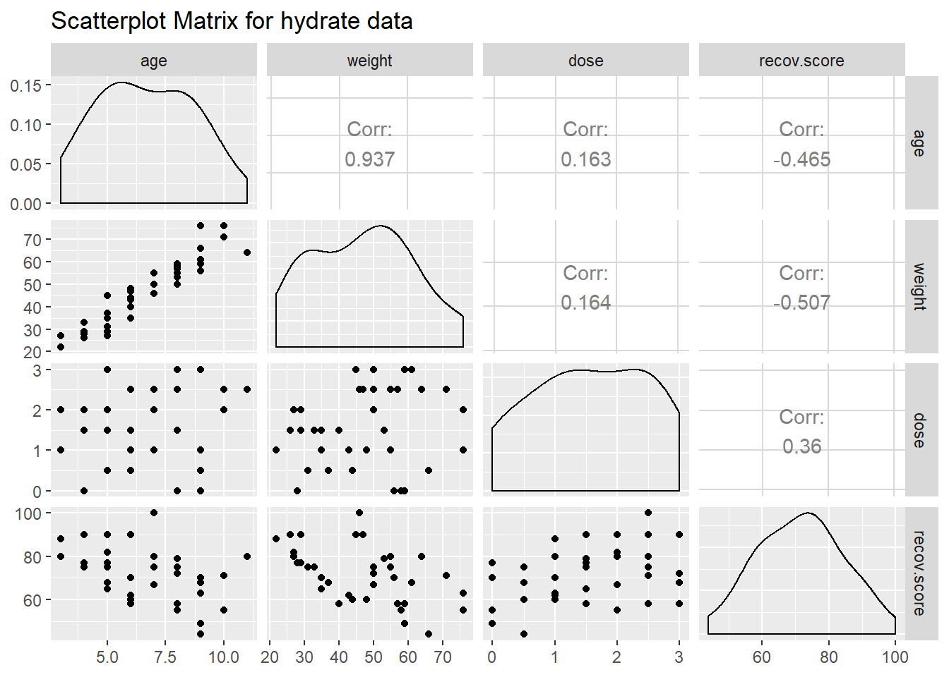
What can we conclude here?
- It looks like
recov.scorehas a moderately strong negative relationship with bothageandweight(with correlations in each case around -0.5), but a positive relationship withdose(correlation = 0.36). - The distribution of
recov.scorelooks to be pretty close to Normal. No potential predictors (age,weightanddose) show substantial non-Normality. ageandweight, as we’d expect, show a very strong and positive linear relationship, with r = 0.94- Neither
agenorweightshows a meaningful relationship withdose. (r = 0.16)
39.2 Are the recovery scores well described by a Normal model?
Next, we’ll do a more thorough graphical summary of our outcome, recovery score, arranging the plots with the help of the cowplot package.
p1 <- ggplot(hydrate, aes(x = recov.score)) +
    geom_histogram(aes(y = ..density..),
                   bins = fd_bins(hydrate$recov.score),
                   fill = '#440154', col = '#FDE725') +
    stat_function(fun = dnorm,
                  args = list(mean = mean(hydrate$recov.score),
                              sd = sd(hydrate$recov.score)),
                  lwd = 1.5, col = '#1FA187') +
    labs(title = "Histogram", x = "Recovery Score", y = "") +
    theme_bw()

p2 <- ggplot(hydrate, aes(x = 1, y = recov.score)) +
    geom_boxplot(fill = '#FDE725', notch = TRUE,
                 col = '#440154', outlier.color = '#440154') +
    labs(title = "Boxplot", x = "", y = "") +
    theme_bw() +
    theme(axis.text.x = element_blank(),
          axis.ticks.x = element_blank())

p3 <- ggplot(hydrate, aes(sample = recov.score)) +
    geom_qq(geom = "point", col = '#440154', size = 2) +
    geom_abline(slope = qq_slope(hydrate$recov.score),
                intercept = qq_int(hydrate$recov.score),
                col = '#1FA187', size = 1.25) +
    labs(title = "Normal QQ", x = "", y = "") +
    theme_bw()

p <- cowplot::plot_grid(p1, p2, p3, align = "h", nrow = 1,
                   rel_widths = c(3, 1, 2))

title <- cowplot::ggdraw() +
    cowplot::draw_label("Recovery Scores from 36 children in the hydrate study",
               fontface = "bold")

cowplot::plot_grid(title, p, ncol = 1, rel_heights=c(0.1, 1))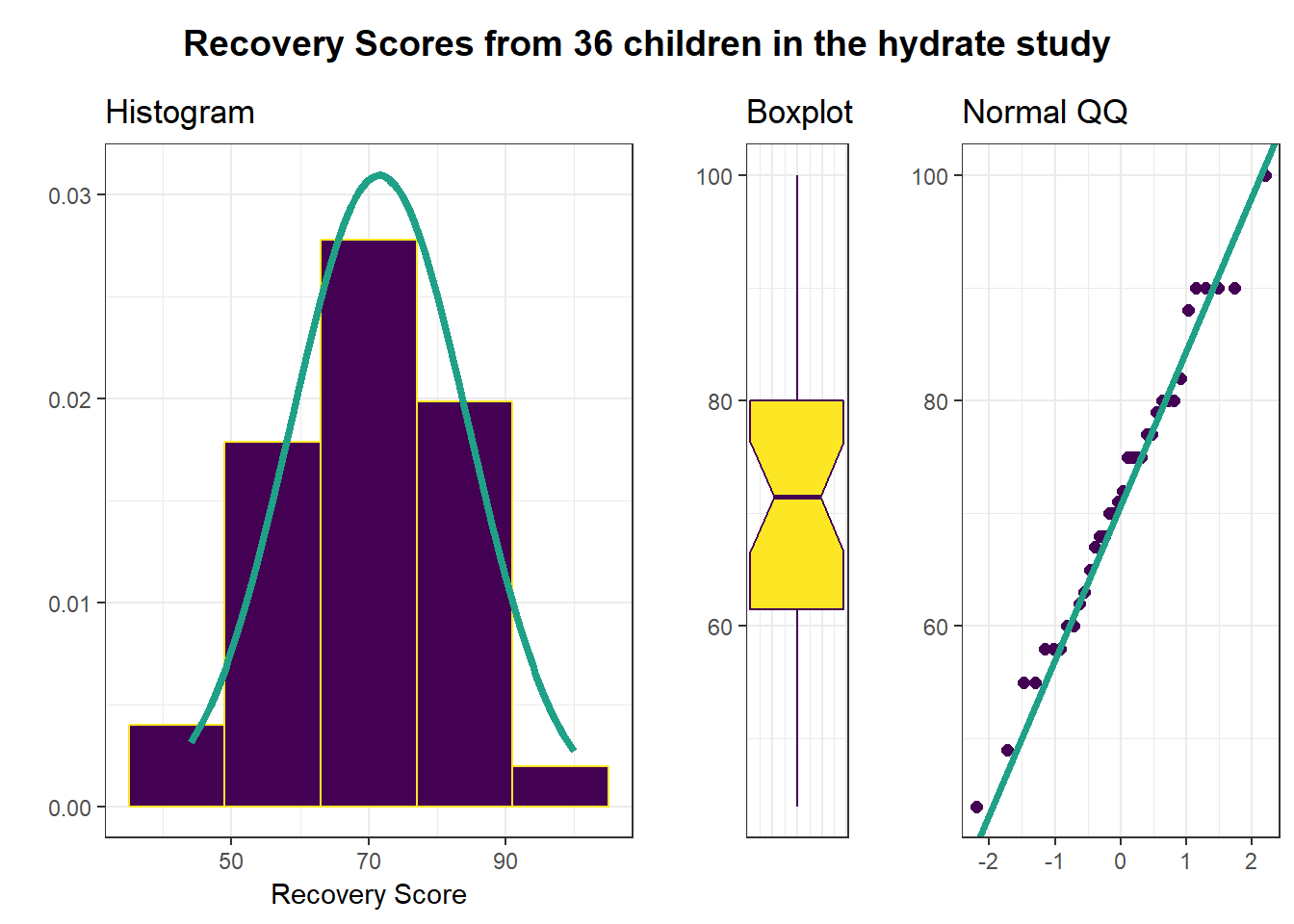
I see no serious problems with assuming Normality for these recovery scores. Our outcome variable doesn’t in any way need to follow a Normal distribution, but it’s nice when it does, because summaries involving means and standard deviations make sense.