Chapter 38 Re-Expression, Tukey’s Ladder & Box-Cox Plot
38.1 “Linearize” The Association between Quantitative Variables
Confronted with a scatterplot describing a monotone association between two quantitative variables, we may decide the data are not well approximated by a straight line, and thus, that a least squares regression may not be not sufficiently useful. In these circumstances, we have at least two options, which are not mutually exclusive:
- Let the data be as they may, and summarize the scatterplot using tools like loess curves, polynomial functions, or cubic splines to model the relationship.
- Consider re-expressing the data (often we start with re-expressions of the outcome data [the Y variable]) using a transformation so that the transformed data may be modeled effectively using a straight line.
38.2 A New Tool: the Box-Cox Plot
As before, Tukey’s ladder of power transformations can guide our exploration.
| Power (\(\lambda\)) | -2 | -1 | -1/2 | 0 | 1/2 | 1 | 2 |
|---|---|---|---|---|---|---|---|
| Transformation | 1/y2 | 1/y | 1/\(\sqrt{y}\) | log y | \(\sqrt{y}\) | y | y2 |
The Box-Cox plot, from the boxCox function in the car package, sifts through the ladder of options to suggest a transformation (for Y) to best linearize the outcome-predictor(s) relationship.
38.2.1 A Few Caveats
- These methods work well with monotone data, where a smooth function of Y is either strictly increasing, or strictly decreasing, as X increases.
- Some of these transformations require the data to be positive. We can rescale the Y data by adding a constant to every observation in a data set without changing shape.
- We can use a natural logarithm (
login R), a base 10 logarithm (log10) or even sometimes a base 2 logarithm (log2) to good effect in Tukey’s ladder. All affect the association’s shape in the same way, so we’ll stick withlog(base e). - Some re-expressions don’t lead to easily interpretable results. Not many things that make sense in their original units also make sense in inverse square roots. There are times when we won’t care, but often, we will.
- If our primary interest is in making predictions, we’ll generally be more interested in getting good predictions back on the original scale, and we can back-transform the point and interval estimates to accomplish this.
38.3 A Simulated Example
set.seed(999); x.rand <- rbeta(80, 2, 5) * 20 + 3
set.seed(1000); y.rand <- abs(50 + 0.75*x.rand^(3) - 0.65*x.rand + rnorm(80, 0, 200))
scatter1 <- data.frame(x = x.rand, y = y.rand) %>% tbl_df
rm(x.rand, y.rand)

ggplot(scatter1, aes(x = x, y = y)) +
    geom_point(shape = 1, size = 3) +
    ## add loess smooth
    geom_smooth(se = FALSE, col = "dodgerblue") +
    ## then add linear fit
    geom_smooth(method = "lm", se = FALSE, col = "red", linetype = "dashed") +
    labs(title = "Simulated scatter1 example: Y vs. X")
`geom_smooth()` using method = 'loess' and formula 'y ~ x'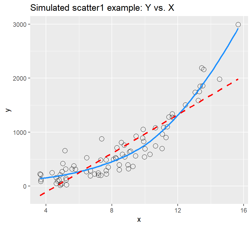
Having simulated data that produces a curved scatterplot, I will now use the Box-Cox plot to lead my choice of an appropriate power transformation for Y in order to “linearize” the association of Y and X.
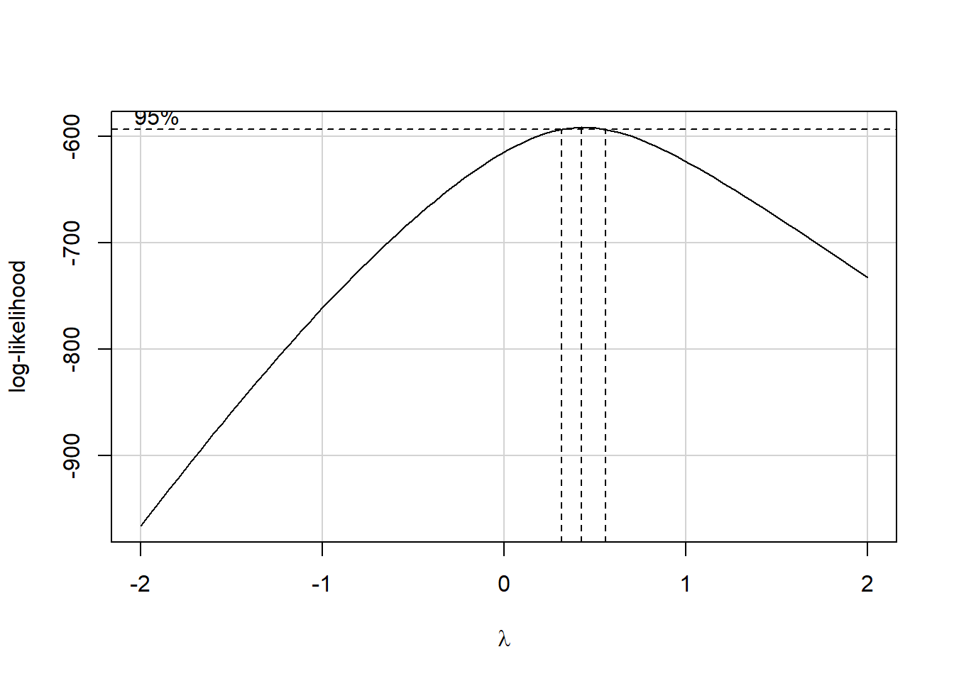
Estimated transformation parameter
   Y1
0.437
The Box-Cox plot peaks at the value \(\lambda\) = 0.44, which is pretty close to \(\lambda\) = 0.5. Now, 0.44 isn’t on Tukey’s ladder, but 0.5 is.
| Power (\(\lambda\)) | -2 | -1 | -1/2 | 0 | 1/2 | 1 | 2 |
|---|---|---|---|---|---|---|---|
| Transformation | 1/y2 | 1/y | 1/\(\sqrt{y}\) | log y | \(\sqrt{y}\) | y | y2 |
If we use \(\lambda\) = 0.5, on Tukey’s ladder of power transformations, it suggests we look at the relationship between the square root of Y and X, as shown next.
p1 <- ggplot(scatter1, aes(x = x, y = y)) +
    geom_point(size = 2) +
    geom_smooth(se = FALSE, col = "dodgerblue") +
    geom_smooth(method = "lm", se = FALSE, col = "red", linetype = "dashed") +
    labs(title = "scatter1: Y vs. X")

p2 <- ggplot(scatter1, aes(x = x, y = sqrt(y))) +
    geom_point(size = 2) +
    geom_smooth(se = FALSE, col = "dodgerblue") +
    geom_smooth(method = "lm", se = FALSE, col = "red", linetype = "dashed") +
    labs(title = "scatter1: Square Root of Y vs. X")

gridExtra::grid.arrange(p1, p2, nrow = 1)
`geom_smooth()` using method = 'loess' and formula 'y ~ x'
`geom_smooth()` using method = 'loess' and formula 'y ~ x'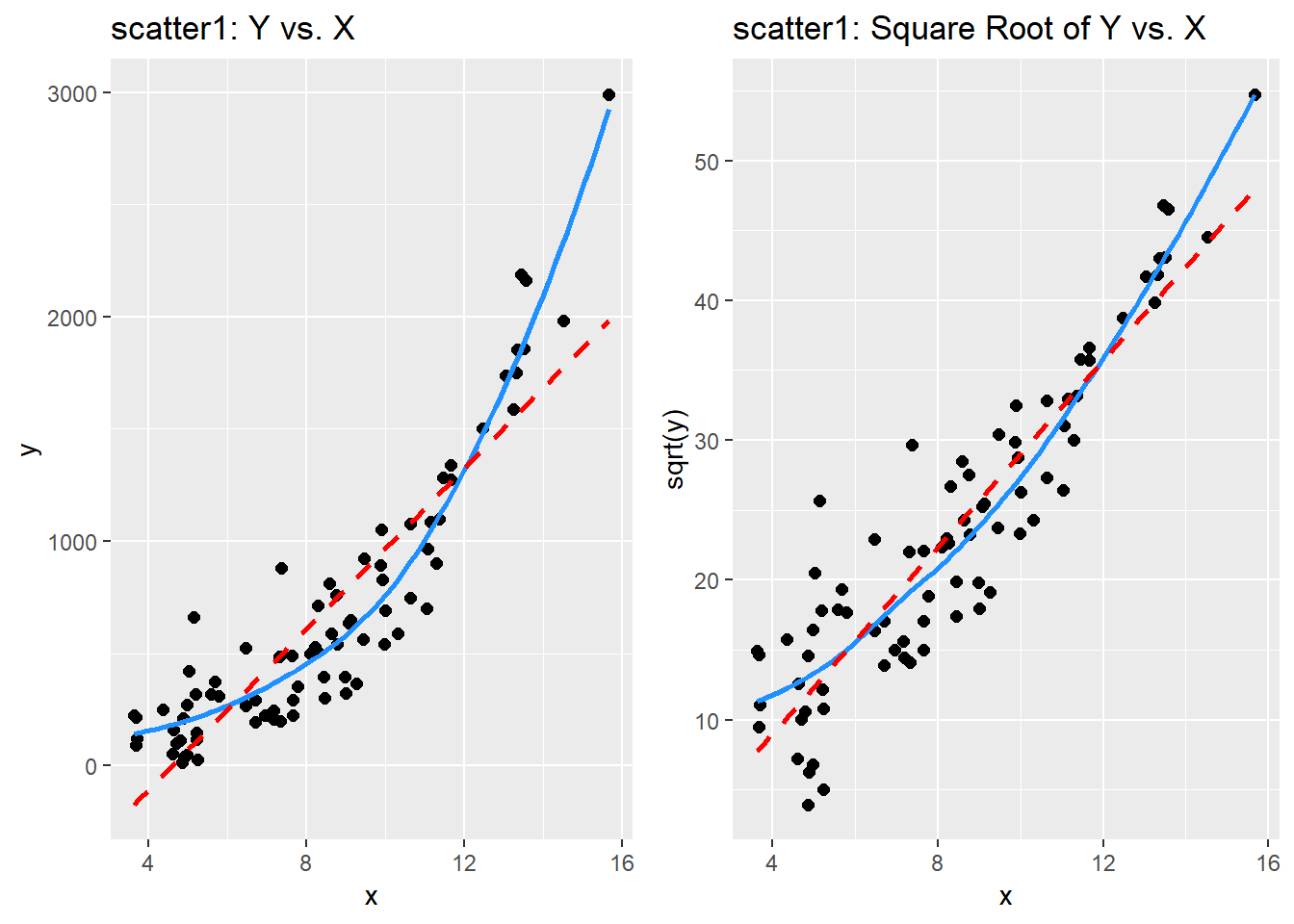
By eye, I think the square root plot better matches the linear fit.
38.4 Checking on a Transformation or Re-Expression
We can do three more things to check on our transformation.
- We can calculate the correlation of our original and re-expressed associations.
- We can use the
testTransformfunction in thecarlibrary in R to perform a statistical test comparing the optimal choice of power (\(\lambda\) = 0.44) to various other transformations. - We can go ahead and fit the regression models using each approach and compare the plots of studentized residuals against fitted values from the data to see if the re-expression reduces the curve in that residual plot, as well.
Option 3 is by far the most important in practice, and it’s the one we’ll focus on going forward, but we’ll demonstrate all three here.
38.4.1 Checking the Correlation Coefficients
Here, we calculate the correlation of original and re-expressed associations.
[1] 0.891[1] 0.914The Pearson correlation is a little stronger after the transformation. as we’d expect.
38.4.2 Using the testTransform function
Here, we use the testTransform function (also from the car package) to compare the optimal choice determined by the powerTransform function (here \(\lambda\) = 0.44) to \(\lambda\) = 0 (logarithm), 0.5 (square root) and 1 (no transformation).
                       LRT df  pval
LR test, lambda = (0) 46.2 1 1e-11 LRT df pval
LR test, lambda = (0.5) 1.02 1 0.3 LRT df pval
LR test, lambda = (1) 63.8 1 1e-15- It looks like only the square root (\(\lambda\) = 0.5) of these three options is not significantly worse by the log-likelihood criterion applied here than the optimal choice.
- That’s because it’s the only one with a p value larger than our usual standard for statistical significance, of 0.05.
38.4.3 Comparing the Residual Plots
We can fit the regression models, obtain plots of residuals against fitted values, and compare them to see which one has less indication of a curve in the residuals.
model.orig <- lm(scatter1$y ~ scatter1$x)
model.sqrt <- lm(sqrt(scatter1$y) ~ scatter1$x)

par(mfrow=c(1,2))
plot(model.orig, which = 1, caption = "Y vs. X Residual Plot")
plot(model.sqrt, which = 1, caption = "Square Root Y vs. X Residual Plot")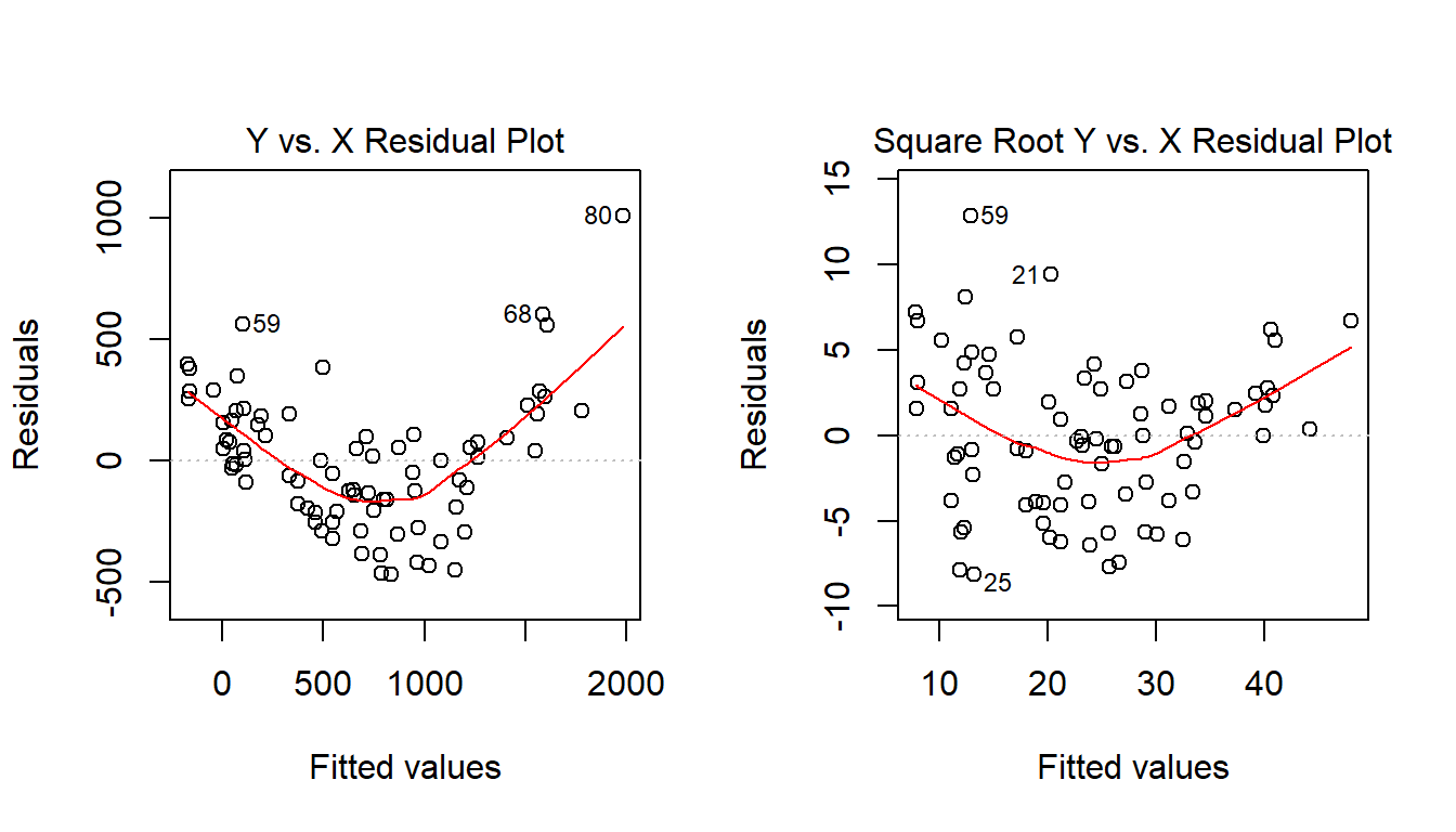
What we’re looking for in such a plot is the absence of a curve, among other things, we want to see “fuzzy football” shapes. The square root version, on the right, is a modest improvement in this regard over the original plot. It does look a bit less curved, and a bit more like a random cluster of points, so that’s nice.